What Wood Tones and Paint Colors Actually Go with 90s Honey Oak Trim?
Reader Disclosure: This post contains contextual affiliate links. If you purchase through them, we may earn an affiliate commission at no additional cost to you. We recommend architectural millwork treatments, paint selections, and hardware based on verified color wheel science, timber metallurgy, and long-term durability ratings.
The most successful strategy for what wood tones go with honey oak trim requires pairing the warm golden wood with rich dark walnut or espresso furniture to establish intentional 80/20 contrast, while painting walls in soft green-grays or warm creamy off-whites that neutralize orange undertones. Avoid red-toned woods like cherry or mahogany because competing warm undertones clash aggressively. Replace dated 1990s high-gloss brass hardware with matte black pulls, and install 3000K warm-neutral LED lighting to prevent amber clear coats from looking radioactive orange.
Homes built between 1985 and 2004 feature solid red oak baseboards, doors, and cabinets. Tearing out solid hardwood trim costs upwards of $15,000. In this guide, you will master the color wheel science that neutralizes orange wood, review four proven paint color families, explore furniture wood pairings, and discover hardware upgrades that make original oak look intentional.
Interactive Stain & Paint Matcher: Simulate how different wall colors, wood stains, and hardware finishes interact with your original trim before buying paint samples. Launch the Free Wood Tone & Paint Color Matcher →
Quick Comparison: Best Paint & Wood Matches for Honey Oak
Neutralizing warm golden oak requires pairing complementary cool undertones or harmonious warm creams that celebrate wood grain without triggering visual friction. Review these proven designer combinations before buying paint samples or ordering furniture:
| Color Family | Paint Code Example | LRV Score | Undertone Chemistry | Best Furniture Wood | Recommended Hardware Pairing |
|---|---|---|---|---|---|
| Muted Sage Green | Sherwin-Williams Sea Salt (SW 6204) | 63 | Soft green with cool gray base | Rich Dark American Walnut | Matte black solid brass cabinet pulls |
| Warm Creamy Off-White | Benjamin Moore Swiss Coffee (OC-45) | 81.9 | Warm beige with gentle yellow cast | Deep Espresso or Blackened Oak | Muted brushed brass cabinet knobs |
| Balanced Modern Greige | Benjamin Moore Revere Pewter (HC-172) | 55.5 | Earthy gray with warm stone undertone | Blonde White Oak or Natural Rattan | Oil-rubbed bronze drawer pulls |
| Deep Moody Charcoal | Sherwin-Williams Iron Ore (SW 7069) | 6 | Soft velvety black with cool slate base | Medium Caramel Oak or Walnut | Matte black interior door levers |
The Color Wheel Science: Why 90s Honey Oak Looks So Orange
To modernize honey oak, you must understand why it looks intensely orange today compared to when builders installed it. The answer lies in the chemical degradation of traditional wood finishes combined with optical physics.
Builders in the 1980s and 1990s sealed solid red oak with solvent-based oil polyurethane. Alkyd resins in oil finishes oxidize when exposed to ambient oxygen and ultraviolet light. Over 25 years, this oxidation ambers the clear coat, turning golden-tan finish into saturated orange that accentuates coarse grain.
Homeowners frequently make this orange tone worse by falling into two common color wheel traps:
- The Simultaneous Contrast Trap: Blue and cool gray sit directly opposite orange on the color wheel. When you paint walls in a cool gray, simultaneous contrast activates. Your eye perceives the blue pigments in the paint and exaggerates the complementary orange wavelengths in the wood. The cool paint forces oak trim to glow like fluorescent cheddar cheese.
- The Stark Pure White Mistake: Painting walls in an icy bright white creates severe contrast against dark golden trim. The stark white background outlines every door casing in sharp orange lines. This sharp boundary magnifies every perimeter line.
- The Optical Solution: Select wall paints with soft green-gray undertones to calm orange wavelengths, or warm creamy off-whites that share gentle golden pigments to soften visual boundaries.
The 80/20 Contrast Formula: What Wood Tones Go with Honey Oak Trim Without Clashing
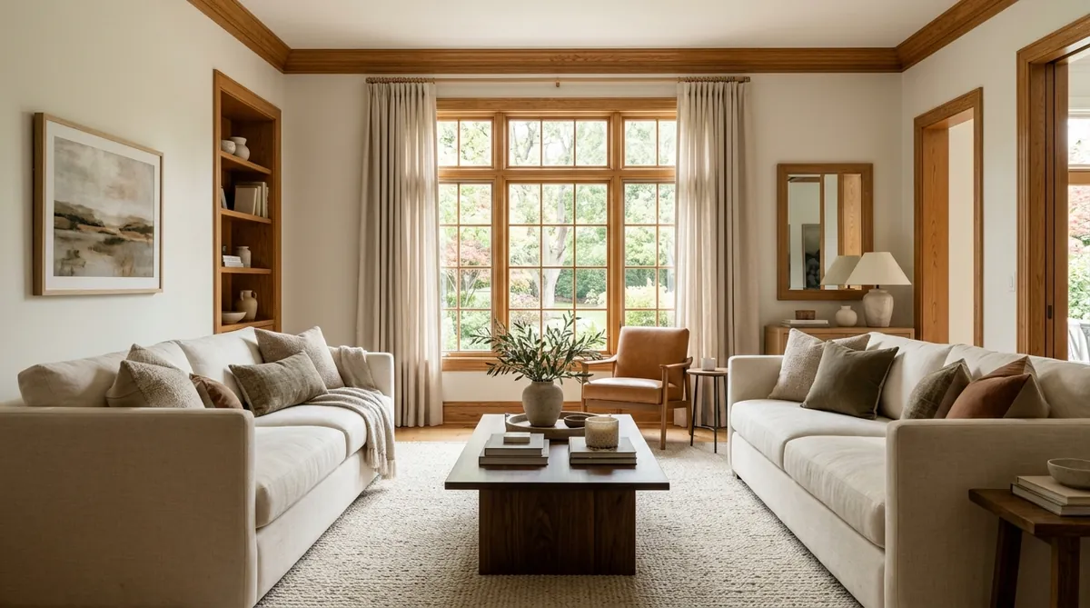
Living with honey oak trim does not force you to buy matching honey oak furniture. Buying matching golden oak tables creates an overwhelming wooden box effect. Seasoned decorators balance architectural wood trim by applying the 80/20 Wood Contrast Formula.
Strategy 1: Ground the Space with Dark American Walnut and Espresso
Dark walnut and espresso represent the most effective furniture woods to pair with honey oak trim. Dark walnut contains deep brown undertones that establish separation from orange oak. Place a dark walnut coffee table in your living room. The deep wood anchors the space and frames perimeter baseboards.
Strategy 2: Layer Blonde White Oak and Natural Rattan
In Scandinavian or Japandi interiors, pair honey oak trim with raw blonde white oak or natural rattan. Blonde white oak features pale beige undertones without amber resin. Pale oak chairs introduce organic texture and prevent dark wood saturation.
Strategy 3: Eliminate Clashing Near-Miss Red Woods
The most severe furniture error in an oak-trimmed home is introducing red-undertone woods. Banish red cherry, red mahogany, and pink cedar from your floor plan. The red undertones in cherry collide with golden-orange oak. Because both woods compete for warmth without sufficient contrast, they create visual clutter.
Strategy 4: Align Wood Sheens and Surface Finishes
When mixing wood species, maintain uniform sheen levels. Traditional 90s oak trim features a soft semi-gloss or satin clear coat. Choose furniture with satin, matte oil, or wire-brushed finishes. High-gloss lacquers reflect glare and show scratches. Soft satin sheens keep wood grains feeling grounded.
The 4 Paint Color Families That Modernize Honey Oak
Applying the correct wall paint represents the most cost-effective way to update honey oak trim. Designers rely on four color families to tone down orange undertones and establish architectural sophistication.
1. Muted Green-Grays (The Neutralizing Champions)
Soft sage greens and green-grays function as the ultimate secret weapon against orange wood trim. Green sits adjacent to blue on the color spectrum, providing cool optical contrast that calms yellow and orange wavelengths without the harsh clash of true blue-grays.
- Sherwin-Williams Sea Salt (SW 6204): A delicate green-gray with an LRV of 63 that softens amber oak trim into a fresh, natural forest frame.
- Benjamin Moore October Mist (1495): A balanced, silvery sage with an LRV of 46. This earthy tone makes honey oak look intentional and grounded.
- Sherwin-Williams Comfort Gray (SW 6205): One shade darker than Sea Salt with an LRV of 54. This shade provides depth for rooms with tall vaulted ceilings.
2. Warm Creamy Off-Whites (The Scandinavian Fresh Look)
If you want bright walls without highlighting orange trim, bypass cold gallery whites and select warm creamy off-whites with gentle yellow and beige pigments.
- Benjamin Moore Swiss Coffee (OC-45): The gold standard for honey oak trim with an LRV of 81.9. Swiss Coffee softens trim borders and creates an inviting Scandinavian atmosphere.
- Sherwin-Williams Greek Villa (SW 7551): A clean, sunlit off-white with an LRV of 84 that avoids sterile gray casts across open floor plans.
- Sherwin-Williams Alabaster (SW 7008): A balanced warm white with an LRV of 82 that prevents harsh shadow lines around oak casings.
3. Balanced Greiges (The Modern Transitional Standard)
A true greige combines gray and beige into a flexible transitional neutral. The greige must lean warm to avoid activating color wheel clash.
- Benjamin Moore Revere Pewter (HC-172): A transitional neutral with an LRV of 55.5 that bridges traditional oak baseboards and modern clean-lined furniture.
- Sherwin-Williams Accessible Beige (SW 7036): A warm greige with an LRV of 58 that downplays amber trim in south-facing rooms.
- Benjamin Moore Edgecomb Gray (HC-173): An organic greige with an LRV of 63 that brightens hallways while maintaining warmth.
4. Deep Moody Charcoals (The Bold High-Drama Move)
For dining rooms, powder rooms, or library dens, dark walls create luxurious contrast. Dark charcoal recedes visually. This dark field allows warm oak trim to stand forward like sculptural woodwork.
- Sherwin-Williams Iron Ore (SW 7069): A velvety charcoal with an LRV of 6 that provides striking contrast without the harshness of pure black.
- Benjamin Moore Wrought Iron (2124-10): A dark graphite with an LRV of 8 featuring subtle navy-gray undertones that frame honey oak millwork with elegance.
Natural Daylight & Lighting Kelvin Temperature Traps
Paint color and wood stain appearance change under different lighting conditions. Avoid these critical lighting traps across your home:
- North-Facing Rooms: North windows receive cool daylight that intensifies orange trim. Avoid greiges with cool bases. Choose warm off-whites like Benjamin Moore Swiss Coffee to inject warmth.
- South-Facing Rooms: South windows flood spaces with warm sunlight that amplifies yellow undertones. These bright rooms handle cool green-grays like Sherwin-Williams Sea Salt and deeper charcoals easily.
- The 2700K Bulb Trap: Old incandescent bulbs and budget 2700K LEDs emit heavy yellow light. This yellow cast turns oak trim into radioactive orange after sunset.
- The 5000K Daylight LED Error: Installing 5000K daylight bulbs creates an institutional blue glow that clashes with warm wood grain. This blue cast makes natural timber look cheap.
- The 3000K Warm-Neutral Sweet Spot: Replace bulbs with 3000K warm-neutral LEDs. At 3000 Kelvin, the light provides clean white clarity that illuminates room colors accurately without casting yellow glare.
Modernizing Honey Oak Kitchen Cabinets: Countertops and Hardware
Original 1990s honey oak kitchen cabinets can undergo a complete transformation without cabinet refacing or painting.
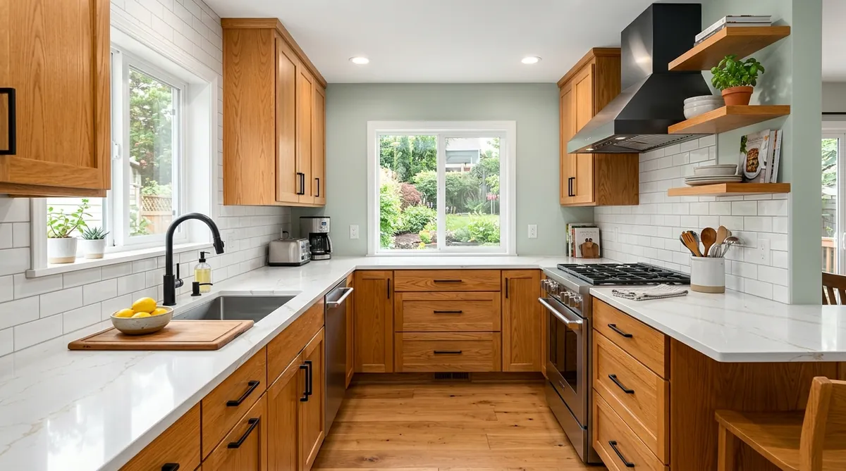
Execute these four high-impact design updates to modernize oak cabinetry:
- Install White Quartz Countertops: Replace brown laminate with white quartz featuring subtle gold veining (such as Calacatta Gold). Bright quartz reflects light, while gold veining ties into honey oak tones.
- Swap Stamped Brass for Matte Black Hardware: 90s oak cabinets came standard with shiny brass pulls that reinforce orange tones. Swap dated pulls for heavy solid brass matte black cabinet pulls. Black hardware creates crisp framing lines that modernize cabinet doors instantly.
- Restore Wood Luster with Natural Citrus Cleaner: Treat kitchen cooking grease with Howard Orange Oil Wood Polish and Conditioner. This deep-penetrating oil hydrates dry wood pores. This treatment restores a supple satin glow.
- Add White Subway Backsplash: Install classic white glazed subway tile with soft gray grout. The glossy ceramic surface bounces daylight across dark countertop corners.
Flooring Solutions: What to Lay Next to Honey Oak Baseboards
Selecting flooring to install next to honey oak baseboards represents a major stumbling block for homeowners. Avoid these costly flooring mistakes:
- Never Install Cool Gray Luxury Vinyl Plank: Gray wood-look vinyl plank flooring is the single worst choice for an oak-trimmed home. The fake gray wood grain and cool undertones clash with authentic warm red oak baseboards. This combination looks uncoordinated and cheap.
- Avoid Matching Honey Oak Hardwood: Installing new hardwood stained in the exact same honey oak tone creates an overwhelming sea of orange flooring that swallows furniture.
- Install Natural Blonde White Oak: Select wide-plank European white oak with natural clear matte sealers. Pale beige tones create subtle contrast beneath honey oak baseboards. This neutral floor keeps rooms bright and contemporary.
- Choose Large-Format Porcelain Stone Tile: In entryways and kitchens, install large 12×24 inch porcelain tiles in warm greige or creamy limestone. Real stone textures break up wood surfaces and ground the room.
Window Treatments and Rugs: Softening High-Contrast Millwork
Because honey oak trim frames windows and doorways in strong, high-contrast orange rectangles, your choice of textiles softens those architectural borders.
Choose Textured Neutral Linen Drapery
Avoid heavy synthetic drapes or dark navy curtains that create harsh vertical stripes against oak window casings. Instead, install floor-to-ceiling textured oatmeal linen drapery panels. Mount the curtain rod 4 to 6 inches above the oak casing and extend the brackets 8 to 12 inches past the sides. When curtains hang open, the textured linen rests over outer trim. This setup softens the hard wooden edge and invites maximum daylight.
Layer Natural Wool and Jute Rugs
Place large neutral area rugs that cover at least 70 percent of exposed floor area. An undyed cream wool loop area rug or a bleached natural jute flatweave creates a soft barrier between baseboards and furniture. This light barrier bounces daylight upward and refreshes the room.
Frequently Asked Questions About Honey Oak Trim
Review expert answers to the most common questions homeowners ask when modernizing honey oak wood trim and cabinets:
Can you gel stain honey oak darker without stripping it?
Yes, you can apply dark gel stain directly over clean, lightly scuffed polyurethane without stripping the wood. Gel stain sits on top of the clear coat like a tinted glaze. Two wipe-on coats transform orange oak into deep espresso.
Should you paint honey oak trim white or leave it natural?
If your trim is authentic solid red oak with clear grain, keep it natural and update your wall paint and hardware first. Solid hardwood trim is durable and valuable. If the trim is damaged, painting it with self-leveling urethane enamel paint delivers a clean modern white look.
How do you update honey oak interior doors without replacing them?
To modernize solid six-panel honey oak interior doors, replace dated brass hinges and round knobs with square-rosette matte black door levers. The black geometric hardware creates modern contrast against traditional wood paneling.
What countertop colors look best with honey oak cabinets?
Crisp white quartz featuring delicate warm gold veining looks best with honey oak cabinets. The white field reflects natural light across the kitchen, while warm veins tie into amber wood tones. Honed black granite also provides striking modern contrast.
How do I stop honey oak baseboards from looking dated?
To modernize honey oak baseboards, paint walls in soft green-gray (SW Sea Salt) or warm cream (BM Swiss Coffee), replace old carpet with neutral wool rugs, and swap yellowed plastic outlet covers for white screwless plates.
Action Checklist: Modernizing Honey Oak Without Regret
Work through this step-by-step design checklist before ordering furniture, paint samples, or materials:
- Test peel-and-stick paint samples of Sherwin-Williams Sea Salt, Benjamin Moore Swiss Coffee, and Revere Pewter directly next to your oak baseboards and window casings.
- Replace 2700K incandescent and 5000K daylight bulbs with 3000K warm-neutral LED bulbs across overhead fixtures and lamps.
- Select dark American walnut or deep espresso furniture as your primary 20 percent grounding wood anchor.
- Banish clashing red-undertone woods including cherry, red mahogany, and reddish cedar from your decor palette.
- Swap dated 1990s shiny brass cabinet handles and door knobs for modern matte black or muted brushed brass hardware.
- Hang floor-to-ceiling textured oatmeal linen drapery panels high and wide to soften perimeter oak window frames.
To continue refining your architectural interior color palettes and millwork finishes, explore our companion design guides:
- How to Use the 60-30-10 Color Rule in Living Room Decor (With Real Examples)
- The Best Warm Neutral Paint Colors for Dark, Low-Light Rooms (No Dingy Undertones)
- How to Mix Metal Finishes in a Kitchen or Bathroom: The 70/30 Designer Rule
- Fast Furniture vs. Solid Wood: Why Secondhand Furniture is the Ultimate Decor Investment
- How High to Hang Pendant Lights Over a Kitchen Island (The 30-36 Inch Rule)