How to Use the 60-30-10 Rule in Living Room Decor (With Real Examples)
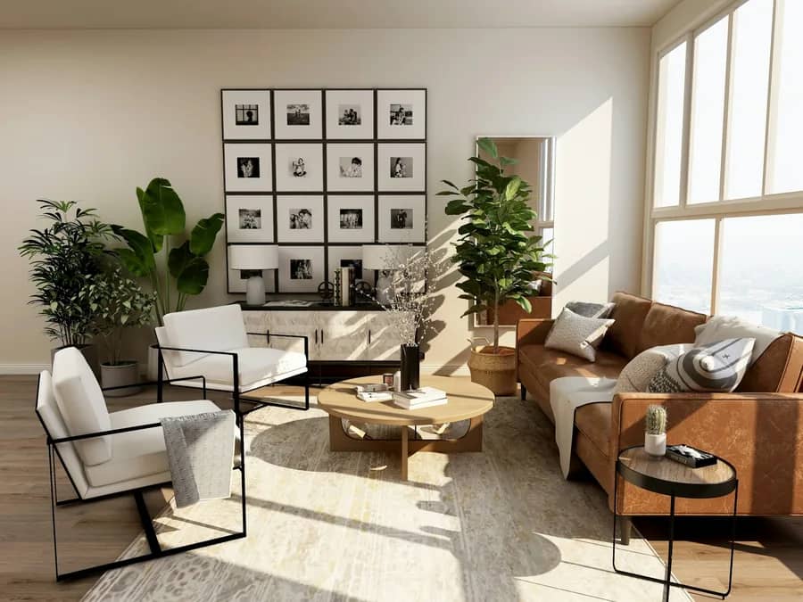
The 60-30-10 rule in living room decor divides your color scheme into three clear parts. Dedicate 60 percent to your main color on walls and large rugs. Use 30 percent for secondary colors on accent chairs and drapes. Reserve 10 percent for bold accent pops on throw pillows, art, and lamps.
Reader Disclosure: This guide contains affiliate links. Buying through our links may earn us a small commission at no extra cost to you. We recommend living room furniture, wool rugs, and paint colors based on direct workshop tests, fabric durability ratings, and practical home use.
Most homeowners struggle with color palettes. They buy furniture piece by piece without a plan. Colors clash and rooms end up feeling messy. Thinking about color as surface area solves this decorating problem. You create a balanced room that looks pulled together without hiring an expensive designer.
Quick Comparison: 4 Designer 60-30-10 Palette Formulas
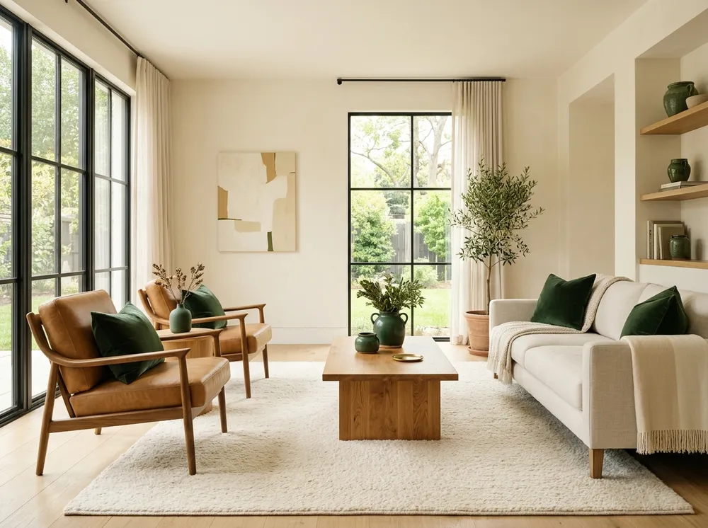
Proven designer palettes match light walls with balanced furniture tones and small color sparks. Pick a warm earthy scheme for cozy comfort, or try coastal blue for an airy feel. Use this palette chart to find paint codes that work in home lighting.
| Interior Aesthetic | 60% Dominant (Foundation) | 30% Secondary (Structure) | 10% Accent (Spark) | Recommended Styling Elements |
|---|---|---|---|---|
| Warm Earthy Modern | Sherwin-Williams Alabaster (SW 7008) | Warm Cognac Leather & Natural White Oak | Sherwin-Williams Pewter Green (SW 6208) | Olive Green Velvet Pillow Covers |
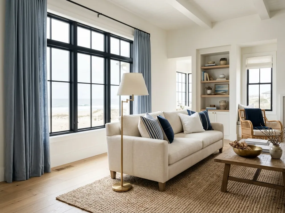
| Coastal Serenity | Benjamin Moore Swiss Coffee (OC-45) | Benjamin Moore Slate Blue (1648) | Warm Brushed Brass & Ochre Gold | Textured Linen Drapery Panels |
| Moody Transitional | Sherwin-Williams Accessible Beige (SW 7036) | Deep Charcoal & Dark Walnut Wood | Sherwin-Williams Cavern Clay (SW 7701) | Handmade Terracotta Ceramic Vases |
| Scandinavian Minimalist | Benjamin Moore Chantilly Lace (OC-65) | Natural Blonde Ash & Pale Heather Gray | Matte Black Cast Iron & Mustard Gold | Matte Black Centerpiece Pedestal Bowls |
Harmonize Your Custom Living Room Palette Instantly
Balancing wall paint, sofa fabric, and accent pillows requires checking color undertones before you buy. Enter your favorite wall colors and furniture finishes into our interactive palette generator tool. The calculator tests your exact 60-30-10 ratios and previews your living room palette balance in seconds.
How to Apply the 60-30-10 Rule in Living Room Layouts
Apply the 60-30-10 rule by spreading visual weight across your walls, floors, and furniture pieces. Decorators do not use tape measures to count square feet. Stand in the doorway. Judge visible color volume across the room from eye level.
The 60 Percent: Foundation Walls and Primary Area Rug
Your 60 percent color acts as the calm background canvas for the whole space. It covers the largest surfaces: walls, ceilings, and main floor rugs:
- Paint main walls in soft neutrals like warm off-white, light greige, or soft cream.
- Lay an 8×10 or 9×12 foot wool or low-pile rug to anchor your main seating group.
- Choose a neutral sofa fabric if you want an open, airy feeling in a small space.
The 30 Percent: Secondary Furniture, Drapes, and Millwork
Your 30 percent secondary color adds depth and contrasts with your neutral wall backdrop. It covers about half as much visual space as your main color:
- Place two matching accent armchairs in rich caramel leather across from the sofa.
- Hang floor-to-ceiling linen curtain panels to frame your windows with vertical color.
- Add warm wood furniture like an oak coffee table or a walnut media credenza.
- Paint a fireplace mantel or interior passage door in a deep secondary accent tone.
The 10 Percent: High-Impact Decorative Accents
Your 10 percent accent color acts like room jewelry. It draws the eye and makes neutral rooms feel alive. Without this small spark of color, neutral spaces look flat and unfinished:
- Add velvet throw pillows and a knit blanket in rich green, navy, or rust.
- Hang framed wall art that carries bold flecks of your accent color.
- Add small table lamps in warm brass or matte black iron with colorful ceramic bowls.
The Renter Playbook: Applying the Rule Without Painting Drywall
Renters can use the 60-30-10 rule without breaking lease terms or losing security deposits. Treat existing off-white or beige rental walls as your free 60 percent foundation. Put your effort and budget into your 30 percent furniture and 10 percent decor layers instead.
When you cannot repaint walls, use these practical renter strategies to style your living room:
- Buy a bold sofa in rich charcoal, saddle leather, or olive. This pulls eyes away from plain drywall.
- Lay a large 9×12 foot natural jute rug over carpet to build warm texture.
- Hang floor-length linen drapes on damage-free tension rods to add height and color.
- Spread your 10 percent accents across art prints, coffee table books, and colorful table lamps.
The Monochrome Trap: Why Texture Replaces Color in Neutral Spaces
Neutral rooms feel cold and boring when decorators forget about fabric texture. When walls, sofa, and pillows all share beige tones, color contrast disappears. You must use touchable textures to add visual interest and warmth when working with neutral palettes.
Use these four practical texture techniques to keep an all-neutral room interesting:
- Pair flat drywall paint with textured fabrics like chunky wool bouclé, slub linen, or ribbed corduroy.
- Pick open-grain wood tables in natural oak or walnut so rich grain lines show through.
- Add reflective 10 percent accents like hammered brass bowls, fluted glass vases, or travertine stone trays.
- Place leafy plants like a potted olive tree in a basket for organic shape.
How to Balance Multi-Colored Rugs and Patterned Textiles
Patterned rugs and print drapes work well when you use them as your color guide. Do not pick wall paint first. Instead, pull your three room colors directly from the threads of your favorite patterned textile.
Follow this three-step color pull method to match patterned rugs with your room furniture:
- Find the main background tone in the rug weave. If the rug base is soft cream, paint your 60 percent walls in that exact tone.
- Spot the second strongest color in the rug pattern. Use this hue for your 30 percent items, like armchair fabric or solid drapery panels.
- Pick small bright flecks of color in the pattern, such as rust or deep blue. Buy matching 10 percent throw pillows and ceramic vases that echo those flecks.
Open-Concept Living Rooms: Connecting Spaces Without Clashing
Open-concept homes look best when living, dining, and kitchen areas share one common wall color. Painting adjoining rooms in totally different colors breaks up the floor plan and feels disjointed. Use one consistent wall paint throughout, then shift secondary colors between zones.
Connect open-plan living rooms and dining spaces by sharing colors across functional zones:
- Keep perimeter walls and wood floors in one single 60 percent neutral paint across both areas.
- Take your living room secondary color, like navy. Use it as the 10 percent accent in dining spaces.
- Add fresh secondary materials in dining spaces, like oak cabinets or counter stools.
The Seasonal Accent Swap: Refreshing Your Room for Under $100
The 60-30-10 rule protects your home decor budget during seasonal room refreshes. Your expensive 60 percent walls and 30 percent sofa stay in place year-round. You update the room mood simply by swapping affordable pillow covers and small accents.
Change your room feel for under one hundred dollars twice a year:
- In spring, put on sage green pillow covers. Add fresh greenery in vases and toss a light throw on the couch.
- In autumn, bring out terracotta vases and rust velvet cushions. Add a thick wool throw and brass candle holders.
How Artificial Lighting Alters 60-30-10 Proportions After Sunset
Light bulb color temperature changes how your living room colors look at night. A bright room at noon can turn yellow or dull under the wrong light bulbs. Match your light bulb warmth to your color palette to keep colors accurate after sunset.
2700K Warm Lighting: The Amber Glow Effect
Standard 2700K bulbs give off an amber, candle-like glow. Warm cream walls look cozy under this light. Cool colors like slate blue or sage absorb yellow rays. They can look muddy under warm bulbs. Use bulbs with a 90 plus CRI rating to keep colors crisp.
3000K Neutral White Lighting: The Designer Standard
A 3000K bulb delivers clean, soft white illumination. It shows both warm and cool colors accurately. Off-white walls stay bright without turning yellow. Blue and green upholstery stays rich. Brass lamps keep their warm golden shine.
Frequently Asked Questions
Find answers on dark sofas, wood trim, open plans, and moody walls to balance your room. Learn how to work with existing furniture and architectural features to make the 60-30-10 color formula work in your home.
Can you use four colors in the 60-30-10 rule?
Yes, you can adapt the rule to a 60-30-10-10 mix in larger living rooms. Keep your 60 percent wall base steady. Split secondary space between cognac leather and walnut. Use two accent colors, like olive green and brass.
Does wood trim and hardwood flooring count toward the percentages?
Yes, wood tones take up real visual space. Light blonde oak floors blend into a neutral 60 percent base. Dark walnut furniture, red cherry trim, or honey oak baseboards act as 30 percent secondary features.
What if my sofa is bright blue or dark leather?
Treat a bold sofa as your 30 percent secondary anchor, not your main base. Paint walls in a calm neutral to balance the couch. Use simple pillows to finish the look.
Can the 60 percent dominant color be dark or moody?
Moody rooms flip the formula. They use charcoal, navy, or deep green across 60 percent of the room. In dark rooms, pick lighter furniture like cream armchairs or bleached oak to balance deep walls.
How does color drenching differ from the 60-30-10 rule?
Color drenching coats walls, trim, and ceilings in one paint color across the whole room. The 60-30-10 rule builds balanced depth across walls, furniture, and textiles using three clear layers.
Related Interior Design and Color Guides
Continue refining your interior decorating and architectural lighting decisions with our practical guides: