Warm Neutral Color Palette Dark Living Room: 5 Colors
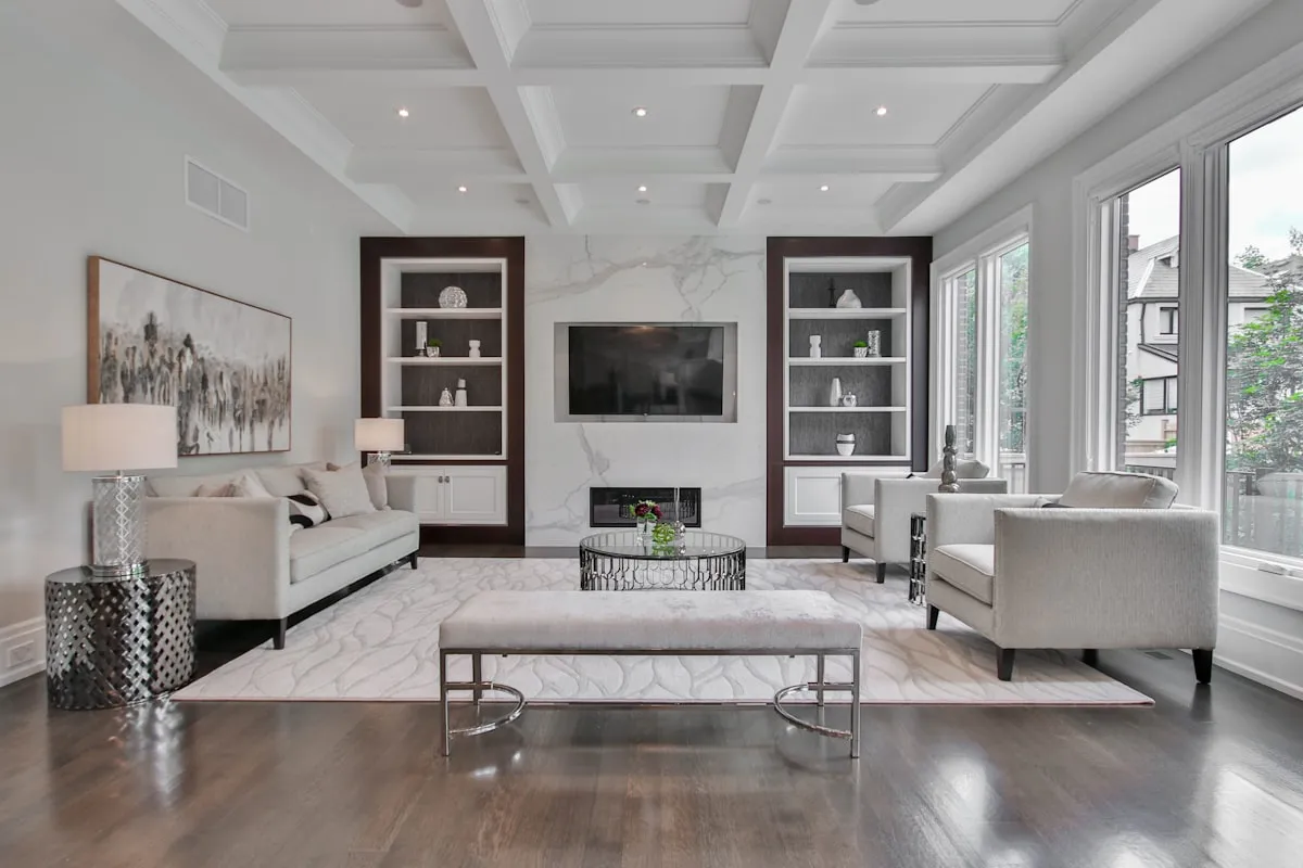
Selecting a warm neutral color palette dark living room spaces need combines paint shades with red, yellow, or peach undertones, such as creamy oatmeal, warm greige, and blushing mushroom taupe. These pigment formulations counteract dim northern shadows and prevent walls from turning dreary gray. Pair these warm wall paints with Light Reflectance Values between 58 and 72, textured boucle upholstery, and warm 2700K lighting.
When dealing with a low-light living room facing north or shaded by buildings, homeowners often make the mistake of painting walls stark white. White paint requires abundant natural daylight to bounce around the room. Without direct sun, stark white walls look dull, cold, and shadowy. The room develops an unflattering gray haze that feels unwelcoming.
Transforming a dim living room requires you to embrace paint pigments that generate their own warmth. Instead of fighting low natural light with clinical white, wrap your space in nuanced neutrals that welcome shadows softly. Before you commit to paint samples, test your room orientation with our interactive Room Light and Paint Undertone Finder to preview how warm pigments perform across your specific daylight levels.
Warm Neutral Color Palette Dark Living Room Guide: Why Stark White Fails
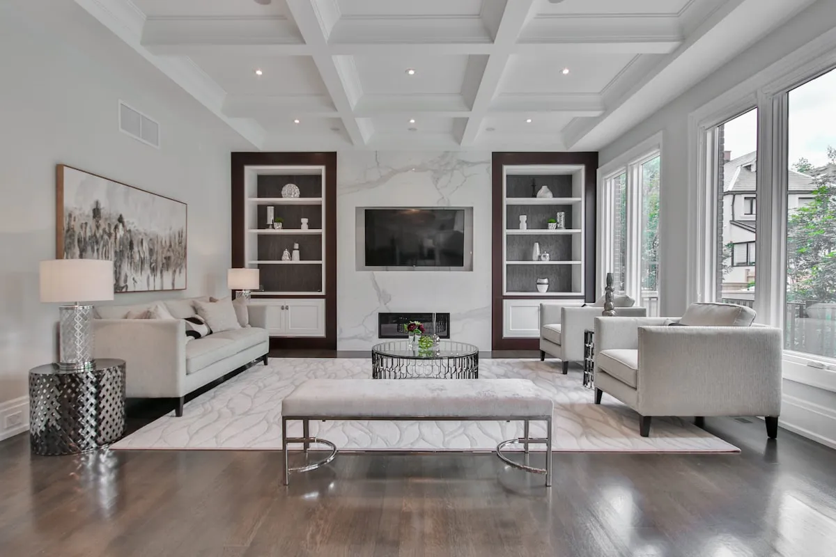
Stark white paint fails in dark living rooms because titanium dioxide pigments require strong natural light to reflect brightness. In low-light rooms, white walls reflect cold gray shadow wavelengths, and this reflection creates a cold, institutional atmosphere. Warm neutrals with yellow or peach bases hold their color integrity in dim light and keep living areas cozy.
Many homeowners believe that painting a dark room white will magically brighten it. This optical myth stems from bright showroom photography. In real homes lacking south-facing windows, white walls cannot manufacture light from nothing. The paint absorbs shadow, and corners turn dingy and neglected.
Pure white fails in low-light environments due to these three physical factors:
- Shadow Amplification: Shadows cast by furniture or ceiling moldings stand out sharply against white walls. The high contrast creates harsh gray gradients that clutter your visual field.
- Pigment Starvation: White paint lacks dense color pigment body. In dim light, it appears chalky and hollow. In contrast, warm neutrals feature complex undertones that maintain substance in deep shadow.
- Northern Light Collision: North-facing windows admit cool, blue-tinted daylight. When blue natural light hits stark white drywall, the room temperature drops visually, and this clash produces a chilly look reminiscent of commercial basements.
If you have an enclosed space, you can also explore our guide on the color drenching small room technique to see how wrapping walls, trim, and ceiling in one continuous warm hue eliminates distracting shadow lines entirely.
Warm Neutral Paint Matrix: 5 Tested Formulas for Low Light
The five best warm neutral paint colors for dark living rooms are creamy oatmeal, warm greige, blushing mushroom taupe, soft biscuit beige, and pale wheat chiffon. Formulated with Light Reflectance Values between 58 and 74, these tested formulas absorb cool shadow tones and bounce soft, luminous warmth across dimly lit seating areas.
Selecting paint for low-light living rooms requires balancing Light Reflectance Value (LRV) with pigment warmth. If the LRV is too high (above 75), the color washes out and looks gray in shadow. If the LRV drops below 50, the room absorbs too much ambient light. The sweet spot for dark living rooms sits between 58 and 74 LRV. Review this pairing matrix to select your ideal formula:
| Color Category | Undertone Composition | Optimal LRV Range | Complementary Fabric Pairing | Best Exposure Direction | Perceptual Room Mood |
|---|---|---|---|---|---|
| 1. Creamy Oatmeal | Yellow-cream base with subtle gray veil | 68 to 72% LRV | Caramel leather & ivory boucle | North-facing / East morning light | Radiant, airy, cozy morning warmth |
| 2. Warm Greige | Balanced beige and gray with warm taupe | 60 to 65% LRV | Chunky wool loops & slate accents | Northwest / Obstructed courtyards | Sophisticated, tailored, clean modern warmth |
| 3. Blushing Mushroom | Muted brown with subtle pink-red clay | 58 to 62% LRV | Washed Belgian linen & bronze metals | All low-light / Basement apartments | Cocooning, grounded, organic luxury |
| 4. Soft Biscuit Beige | Golden honey undertone with chalky base | 64 to 68% LRV | Taupe velvet & natural white oak | North-facing / Heavy tree canopy | Sunlit illusion, comforting, cheerful |
| 5. Pale Wheat Chiffon | Subtle straw yellow with pale ivory base | 70 to 74% LRV | Cream linen & walnut timber | Northeast / Dim urban canyons | Warm daylight glow, expansive and soft |
Each formula in this matrix brings intentional pigment depth. To calibrate your surface reflectance accurately, refer to our comprehensive Light Reflectance Value (LRV) paint guide to calculate how much light your selected shade reflects back into living areas.
The Undertone Science: Yellow, Red, and Peach Pigment Magic
The science of decorating dark living rooms relies on warm undertones neutralizing cool daylight casts. Red, yellow, and peach pigments absorb the blue and gray frequencies of northern daylight. This color interaction transforms cold shadows into warm, golden ambient reflection that feels natural throughout the day.
When sunlight filters through north-facing glass or reflects off neighboring brick buildings, it carries cool wavelengths. In color theory, opposite color wavelengths cancel each other. When you paint walls with a yellow or peach undertone, the warm pigment absorbs blue daylight. The collision cancels out the cold cast and leaves balanced, comfortable warmth.
Choose your undertones intentionally based on your room needs:
- Yellow-Cream Undertones: Yellow pigments mimic natural morning sunlight. They lift gloomy shadows in rooms with high window sills or heavy tree obstruction.
- Red and Pink Clay Undertones: Red pigments create an intimate, cocooning atmosphere. They soften hard architectural angles and pair naturally with aged leather sofas and unlacquered brass accents.
- Peach and Apricot Casts: Peach undertones cast a flattering, radiant glow across skin tones. They neutralize gray northern shadows and make living rooms welcoming for evening entertaining.
Before you commit to a full gallon of paint, examine your color swatches under varying daylight levels. Check our practical guide on how to read paint undertones on swatches to spot hidden undertones before they dry on your living room drywall.
Layering Warm Fabrics: Boucle, Washed Linen, and Honey Oak
Layering textured fabrics and natural timber prevents monochrome warm neutral palettes from looking flat in low light. Nubby wool boucle, washed Belgian linen, and warm honey oak absorb light at varying surface depths. This tactile variation builds visual interest, defines seating zones, and keeps dim living rooms feeling rich and multidimensional.
In low-light spaces, smooth surfaces look uniform and uninteresting. Low ambient light flattens satin fabrics and polished plastics. Textured textiles create micro-pockets of shadow and highlight that add dimensional depth without introducing visual clutter.
Incorporate these four tactile layers across your seating layout:
- Loop-Textured Boucle: Choose upholstery with three-dimensional loops like wool boucle. The nubby texture catches side light and creates tactile topography that invites touch.
- Heavy Belgian Linen Drapes: Floor-to-ceiling unbleached flax linen drapes soften window frames and filter incoming daylight into a warm diffused wash.
- Honey Oak and Warm Timber: Incorporate coffee tables in white oak or honey birch. Natural wood grain grounds pale textiles and prevents rooms from washing out.
- Chunky Wool and Jute Rugs: Ground seating with an oversized low-pile wool rug or layer soft ivory wool over golden jute for organic depth.
Metallic accents also play an essential role in warming dark rooms. Incorporate hardware, picture frames, and lamp bases in unlacquered brass or antique bronze instead of cool chrome or polished nickel. Warm brass reflects amber highlights across surrounding walls, and this warm reflection makes neutral color schemes feel rich and luxurious. For a complete blueprint on balancing room textiles, explore our step-by-step formula on how to mix textures in living room decor.
Artificial Lighting Integration: 2700K Bulbs and Matte Sheens
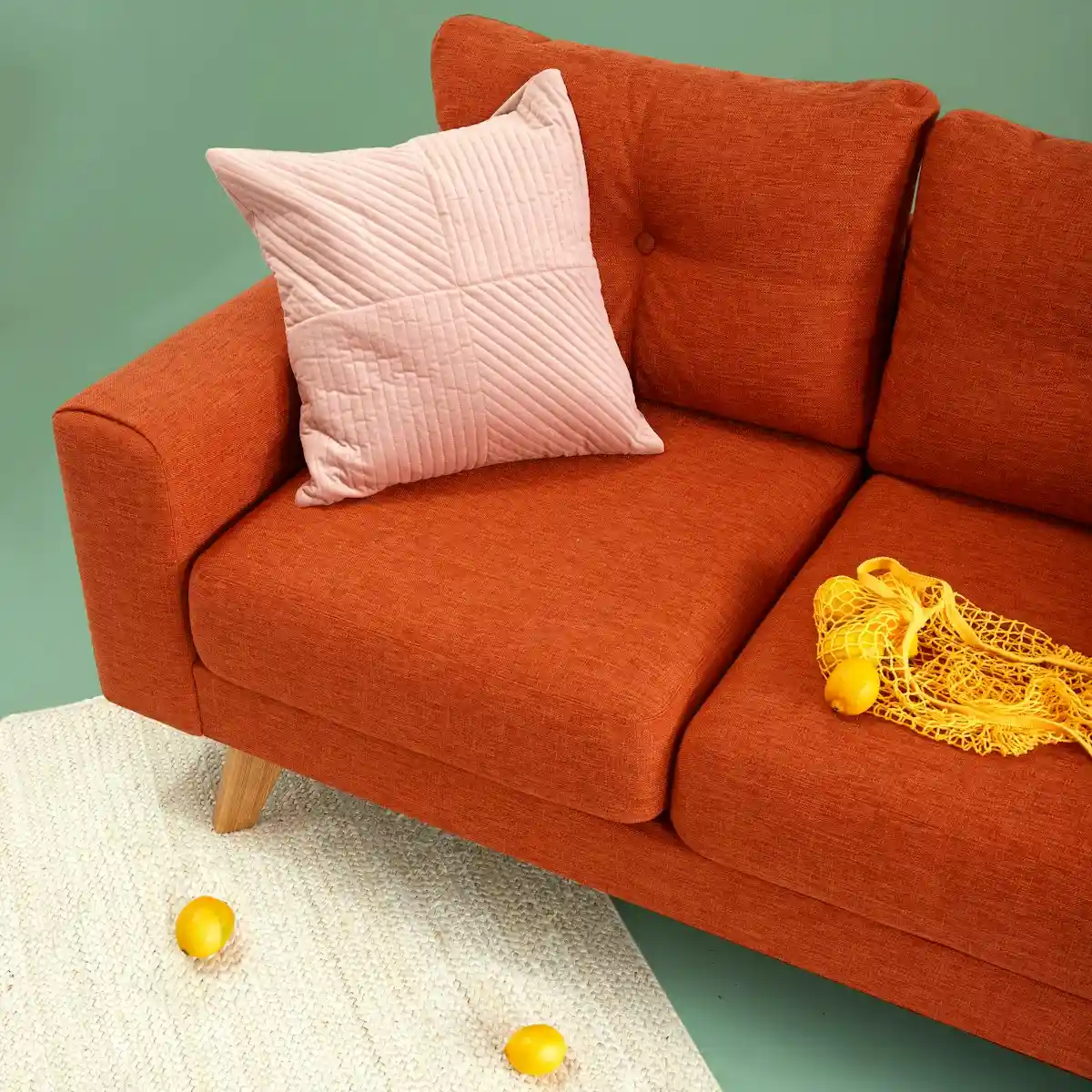
Artificial lighting calibration is essential for warm neutral palettes in low-light rooms. Install 2700 Kelvin warm white LED bulbs with a 90+ Color Rendering Index rating to reveal authentic warm pigments. Avoid cool 4000K or 5000K daylight bulbs, which project bluish glare and turn cozy oatmeal walls into dull institutional gray.
Your choice of light bulb color temperature determines whether your warm neutral paint looks cozy or dreary after dark. Cool daylight bulbs distort yellow and peach undertones, and they flatten wall finishes into sterile office tones. Warm 2700K bulbs mimic natural firelight and make pigments glow with rich warmth.
Follow these three artificial lighting rules to enhance your living room scheme:
- Multi-Point Ambient Lighting: Distribute three to five light sources at varied eye levels. Combine table lamps, wall sconces, and floor uplights instead of relying solely on harsh overhead recessed cans.
- Diffused Linen Shades: Use fabric shades in warm oatmeal or raw linen. Fabric shades soften raw LED bulb points and disperse warm, flattering light into dark corners.
- Dimmer Switch Control: Install dimmer switches on all primary fixtures. Lowering light levels in the evening allows warm neutral paint to develop an intimate, golden glow that turns your living room into an inviting retreat.
Low-Light Paint Sheen and Light Reflection Control
In dark living rooms, always select flat, matte, or eggshell paint sheens over satin or semi-gloss finishes. Glossy paints produce concentrated glare spots that highlight wall dents without illuminating dim corners. Matte sheens diffuse available light evenly across the wall surface, and this matte texture produces a soft, seamless background glow.
Ceiling paint selection also plays a significant role in managing overhead brightness. Standard flat white ceiling paint often reflects cold daylight downward. This stark contrast cancels out the cozy warmth of creamy walls. Tinting your ceiling paint with twenty-five to fifty percent of your wall formulation eliminates this boundary and makes the room feel expansive.
Consider painting your baseboards and door casings in the same warm neutral hue as your walls, or opt for a slightly deeper tone. When trim matches the wall color, the eye moves smoothly across perimeter borders. This continuous color flow reduces perceived visual limits and makes dim rooms feel larger. For precise trim value calibration, consult our rules on whether trim color should be lighter or darker than walls, and explore our ceiling paint flat white vs half-strength formula to balance your overhead plane.
By pairing high-LRV warm neutral paints with rich tactile fabrics, glowing natural timber, and warm 2700K illumination, you can transform the dimmest living room into a luminous haven of cozy elegance.
Consult the Sherwin-Williams LRV technical data sheets for verified architectural specifications and industry reflectance ratings.
Frequently Asked Questions About Warm Neutrals in Dark Rooms
Why does white paint look gray in a dark living room?
White paint looks gray in dark living rooms because it requires strong daylight to reflect clean brightness. Without direct sunlight, white drywall absorbs the cool blue cast of room shadows, and the drywall looks dingy and sterile.
What is the best paint color for a dark living room?
The best paint colors for dark living rooms are warm creamy neutrals with yellow, peach, or warm beige undertones. Shades like creamy oatmeal, warm greige, and soft biscuit beige neutralize cool shadow tones and make dim spaces feel warm and inviting.
What LRV is best for low-light rooms?
The optimal Light Reflectance Value for low-light living rooms sits between 58 and 74. This range reflects maximum ambient light without washing out or looking cold, and this range provides balanced coverage that keeps spaces feeling open and cozy.
How do you make a dark living room feel cozy instead of gloomy?
Make a dark living room feel cozy by painting walls in warm biscuit or oatmeal tones, layer looped boucle and washed linen textiles, incorporate natural honey oak timber, and use warm 2700K lamps on perimeter dimmer switches.
Can you use greige in a north-facing living room?
Yes, but you must select a warm greige with prominent yellow or red-taupe undertones. Avoid cool greiges with green or blue bases, which turn chilly and cement-like under northern daylight exposure.
What light bulb color makes beige walls look best?
Warm white bulbs rated between 2700 Kelvin and 3000 Kelvin with a Color Rendering Index of 90 or higher make beige and warm neutral walls look best. This warm light spectrum enriches pigments and highlights cozy undertones.