Trim Color Lighter or Darker Than Walls: 5 Rules
Reader Disclosure: This post contains affiliate links. If you buy through them, we may earn a commission at no extra cost to you. We only recommend items tested for clean craftsmanship and authentic durability.
Baseboard and trim paint should be lighter than walls to maximize natural light and create classical architectural framing, or two to three shades darker than walls to add vintage drama and ground high ceilings. Never choose trim paint blindly without checking color undertones. Your trim paint must share the exact color undertone family as your wall paint to prevent clashing yellow or muddy pink reflections.
Homeowners constantly hit two common decorating disasters during interior renovations. First, they pair cool blue-grey walls with warm yellow-cream baseboards. That bad pairing makes fresh mouldings look like aged, nicotine-stained plastic. Second, they paint wide baseboards a stark bright white in rooms with standard eight-foot ceilings. That sharp white line slices the wall. It makes low ceilings feel uncomfortably cramped. Explore our complete guide in the Color Palettes & Styling section to build cohesive home palettes.
You can avoid these expensive repainting mistakes before you open a single paint can. Use our interactive Trim Paint Contrast Calculator to test light reflectance values, check undertone pairings, and calculate visual height ratios for your specific room dimensions.
Lighter Trim: The Classical Architectural Horizon
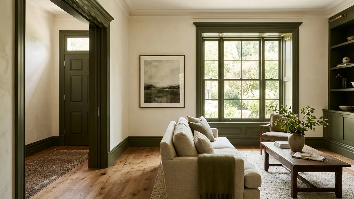
Painting trim lighter than walls provides clean visual borders, bounces ambient daylight into shadows, and establishes a crisp traditional architectural framework that suits ninety percent of residential homes. This time-tested design formula directs incoming daylight inward from windows. It creates a neat perimeter around your floor plan. It also makes colored wall surfaces pop with rich depth.
Traditional wood trim acts like a picture frame around drywall. As your eyes move across a room, light baseboards and window casings build a clear structural outline. This visual contrast separates decorative wall surfaces from functional architectural transitions. It gives older rooms great balance. It also stops dark furniture from blending into the floor edges.
Crisp White Trim with Saturated Color Walls
Crisp off-white or soft white trim provides clean balance against saturated wall colors like deep forest green, navy blue, charcoal, and warm terracotta. Bold wall paints soak up ambient light. A pale trim border bounces window light back into the living area. This keeps deep, moody wall colors from feeling heavy or cave-like.
Select your white trim paint carefully when you use deep wall tones. Avoid blinding pure whites that contain heavy blue tints. Harsh stark whites create jarring visual friction against warm wall colors. Instead, pick a balanced warm white like Benjamin Moore Simply White or Sherwin-Williams Alabaster. These soft formulas ease the transition between wall and woodwork. They still keep their crisp edge.
Apply semi-gloss or satin enamel on the trim. Coat the walls in eggshell or matte. This subtle sheen difference boosts visual depth. The glossy trim shrugs off daily scuffs and catches light highlights. Meanwhile, the low-sheen wall paint hides minor drywall bumps and tape lines.
Why Stark High-Contrast Baseboards Can Lower Low Ceilings
Stark white baseboards paired with dark walls create an aggressive horizontal dividing line that cuts the vertical wall plane in half and makes low ceilings appear significantly lower. When you walk into a room, your eyes spot high-contrast edges first. A bright white stripe along the bottom perimeter draws your gaze straight down to the floor.
If your room has standard eight-foot ceilings, skip high contrast between your baseboards and your wall paint. A wide, bright white baseboard against a dark taupe wall marks the exact spot where the wall ends. That hard horizontal line cuts perceived ceiling height by three to five inches.
To protect vertical height in standard rooms, narrow the gap between wall and trim tones. Choose a trim color only one or two steps lighter on the paint strip instead of jumping to stark white. This gentle shift preserves architectural shape. It also lets the eye sweep upward toward the ceiling without a jolt.
Darker Trim: The Modern Moody and Historic Reversal
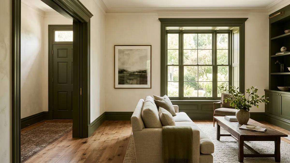
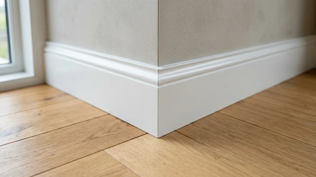
Painting trim two to three shades darker than adjacent walls creates bespoke historic character, frames outdoor window views like architectural art, and conceals everyday shoe scuffs along high-traffic floorboards. This reversed contrast method originated in grand European homes and classic Craftsman bungalows. In those homes, thick stained timber protected soft plaster walls from hard daily wear.
Today, interior architects use dark trim to flip standard builder-grade habits. Coating casings in charcoal, deep mushroom, rich olive, or slate navy anchors the room. It turns simple doorways into handsome passages. It also showcases window woodwork without any major remodeling work.
The Scandinavian Contrast Aesthetic
The modern Scandinavian look pairs pale linen or warm ivory walls with soft taupe, muted putty, or warm greige woodwork. This soft contrast adds gentle warmth without the harsh bite of pure black. It builds a calm, tailored room that flatters light oak floors, raw stone accents, and linen drapes.
To master this Scandinavian style, keep the shade difference small. Pick a soft wall color with a light reflectance value around seventy-five. Then choose a trim paint in the exact same color family with a reflectance value near fifty-five. This twenty-point spread gives you crisp architectural shapes. It also maintains a bright, airy mood across the space.
Paint both the baseboards and window frames in this deeper hue. When sun hits a dark window frame, the wood acts like an art mat for outdoor views. It pulls green trees and blue sky into your sightlines far better than plain white plastic casings.
Highlighting Ornate Victorian and Craftsman Details
Historic homes with fluted casings, corner blocks, and layered crown mouldings gain huge character from darker trim paint. White paint often fills fine wood profiles. It erases delicate carving details under strong sunlight. A deeper satin finish defines every carved shadow line and honors historical charm.
In period restorations, use rich heritage tones like Farrow & Ball Studio Green, Benjamin Moore Kendall Charcoal, or Sherwin-Williams Urbane Bronze. These deep shades echo vintage dark oak woodwork. They also hide old nail holes, wood cracks, and rough settling gaps.
Darker trim also delivers great durability in busy mudrooms, entry halls, and staircases. White baseboards in active paths show black marks from boots, vacuum heads, and pets within days of painting. Deep trim colors hide daily bumps and cut your touch-up tasks in half.
Monochromatic Matching: The Same-Color Different-Sheen Technique
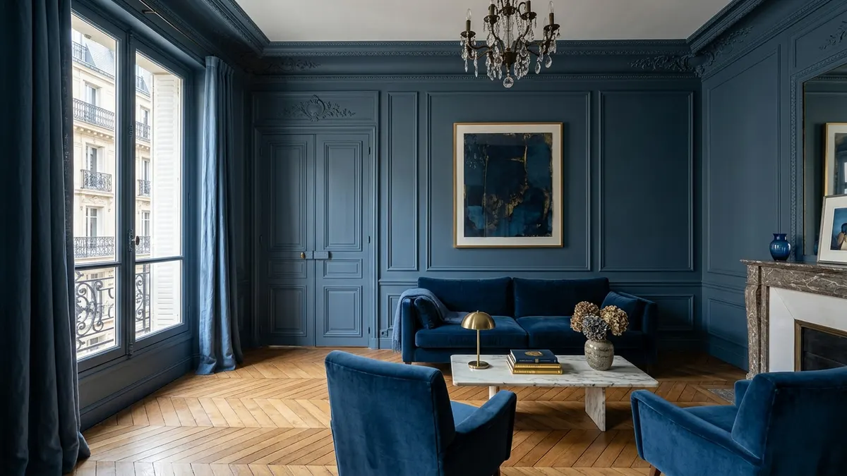
Painting both walls and trim the exact same color while varying the sheen creates an expansive modern look that blurs boundaries and makes compact rooms feel noticeably larger. Designers call this method color drenching. When you remove contrasting borders between walls, doors, and baseboards, you build a single vertical field. The eye glides across the space without any harsh pause.
This method uses surface sheen changes instead of contrasting tints. Roll the drywall in flat, matte, or eggshell paint to soak up glare and build velvet depth. Next, paint all woodwork, doors, and baseboards in matching satin or semi-gloss urethane enamel. Natural light skims across the varied sheens. This showcases the wood profiles while preserving your unbroken field of color.
How Monochromatic Trim Dissolves Awkward Angles
Monochromatic paint works wonders in tricky spaces with many doors, odd closet cuts, heating grills, or sloped ceilings. When you outline five doors with white trim in a small hallway, you turn that passage into a messy visual race. Each door grabs the eye and slices the wall into tiny blocks.
When you paint all five doors, their frames, and the baseboards in the matching wall color, those choppy breaks melt away. The room feels calm, tidy, and peaceful. The doors still work fine, but they stop fighting your main wall art and furniture.
This tactic also rescues rooms with bulky pipe chases or uneven old plaster patches. Matching paint absorbs rough bumps into one smooth plane. That quick fix saves you thousands of dollars in drywall work.
The Light Play Between Matte Drywall and Satin Millwork
Mixing matte walls with satin trim creates rich light shifts all day long. In early morning, low sunlight hits the glossy trim edges. It sketches door outlines in crisp highlights. At night, warm lamp glow spreads across the flat drywall, creating a soft, cozy mood.
Buy your paint from the same maker and batch to ensure an exact color match. Even with the same color code, different sheen bases can dry with subtle tint shifts. Brush out sample swatches side by side on scrap trim before you paint the entire room.
Always prime raw wood trim with a good stain-blocking primer before you apply finish coats. Natural wood knots leak resin through paint over time. A solid primer coat blocks yellow sap stains from spoiling your smooth finish.
The Golden Rule of Undertone Coordination
Ensure trim paint shares the exact same undertone family as your wall paint to prevent trim from reading as sickly yellow, muddy violet, or icy blue under interior lighting. Even when you pick a strong contrast, like dark charcoal trim against soft beige walls, clashing undertones will wreck your color plan.
Every paint shade carries subtle secondary tints that show up under room lamps. Paint colors belong to three main undertone camps: warm, cool, and neutral. Warm colors contain yellow, red, or orange base notes. Cool colors lean on blue, green, or purple. Neutral shades balance grey and tan evenly. If you put cool grey walls next to warm cream trim, the cream looks dusty and yellow. If you set warm beige walls next to icy blue-white trim, the woodwork feels stark and chilly.
The Pure White Paper Comparison Test
Identify hidden paint undertones accurately by placing your paint swatch directly on top of a sheet of bright white printer paper. Pure copy paper has zero warm pigment. It gives you a clean baseline. The instant you drop a paint chip onto the sheet, its secret undertones stand out clearly.
Run this paper test under three different light setups: bright morning sun, soft afternoon light, and warm evening lamps. A white trim tone that looks clean at noon can shift pink or green under low-wattage bulbs. Checking colors at different hours spares you from costly repaint headaches.
Always brush sample colors onto sturdy poster boards instead of painting directly onto your existing wall. Old wall paint bleeds through thin test coats. That old tint ruins your eye for the new color. Move the sample boards around the room for several days to check the tones in every corner.
Interactive Tool Integration: Trim Contrast Calculator
Selecting paint combinations requires balancing wall height, light levels, and architectural style. To speed up your room plan, check your paint choices with our interactive Trim Paint Contrast Calculator. This tool pairs wall tones with trim finishes to check optical balance before you buy any paint cans.
Type in your ceiling height, window exposures, and paint color names. The calculator rates your contrast score and flags undertone clashes. It also picks durable sheen combos based on foot traffic in your home.
Pairing digital color tests with real on-site paint swatches delivers foolproof decorating success. You cut shopping guesswork, dodge wasted paint purchases, and achieve clean designer results on your first try.
Trim Color Strategies and Visual Impact Comparison
Comparing trim color techniques proves that aligning undertones and sheens is far more important than following rigid lighter or darker rules. The following comparison matrix evaluates four popular trim painting strategies across key architectural metrics, durability factors, and optimal paint finishes.
| Design Strategy | Visual Space Effect | Scuff & Dirt Visibility | Architectural Style | Best Paint Finish Pairings |
|---|---|---|---|---|
| Lighter Trim Than Walls | Crisp, traditional, formal framing. | High; shows black vacuum marks easily. | Traditional, Colonial, Transitional. | Eggshell walls with Semi-Gloss white trim. |
| Darker Trim Than Walls | Grounded, cozy, historic character. | Low; conceals dust and scuffs well. | Craftsman, Victorian, Modern Eclectic. | Matte cream walls with Satin taupe/charcoal trim. |
| Monochromatic (Same Hue) | Expansive, continuous, modern height. | Moderate; depends on chosen color value. | Modern Minimalist, Parisian, Contemporary. | Flat/Eggshell walls with Semi-Gloss matching trim. |
| High-Contrast Black Trim | Dramatic, graphic, defines view lines. | Very Low; hides scuffs, shows white dust. | Industrial Modern, Art Deco, Farmhouse. | Crisp off-white walls with Satin iron/black trim. |
Pick your paint strategy to suit the unique traits of your home. If your room has low ceilings and many doors, choose monochromatic color matching. If your home has tall ceilings and classic wood details, try rich contrast trim. In standard suburban layouts with good sunlight, crisp lighter trim remains a timeless winner.
Frequently Asked Questions About Trim and Baseboard Paint
Direct answers to common homeowner inquiries regarding interior doors, window sashes, and ceiling crown moulding.
Should baseboards be lighter or darker than walls?
Baseboards can be lighter or darker depending on the design aesthetic. Lighter trim provides classic, crisp framing and brightens rooms, while darker trim creates rich historic drama, hides shoe scuffs, and frames views.
What happens if baseboard and wall undertones clash?
If trim and wall undertones clash, the trim can look dirty or discolored. For example, pairing cool blue-grey walls with warm yellow-cream trim makes the baseboards look like stained, yellowed plastic.
Should interior doors match the trim or the wall color?
Interior doors traditionally match the trim color and finish. However, in modern monochromatic spaces, painting doors the exact wall color helps them blend smoothly, while painting doors dark adds striking graphic focal points.
Does painting trim the same color as walls make rooms look bigger?
Yes, painting trim and walls the exact same color eliminates contrasting horizontal borders that chop up the space. This unbroken vertical color plane draws the eye upward, making compact rooms feel taller and more expansive.
What is the most durable paint sheen for baseboards?
Semi-gloss or satin water-based urethane enamel is the most durable finish for baseboards. These hard-curing enamels resist scuffs from shoes and vacuum cleaners while allowing easy wiping with a damp cloth.