🎨Color Theory & Finishes18 Curated Articles

Color Palettes & Aesthetic Harmony

A balanced residential palette follows the 60-30-10 distribution ratio: 60 percent dominant wall or rug color, 30 percent secondary furniture upholstery or drapery, and 10 percent high-contrast accent decor. Natural lighting temperature changes how paint pigments look on your walls. North-facing windows deliver cool, blue-tinted daylight that turns crisp whites sterile and gray. Counteract cool northern light with creamy warm whites and beige undertones. South-facing rooms receive intense golden sun all day, which makes warm paint shades look oversaturated and pairs best with cooler sage, slate, or greige tones.

Identify the fixed architectural undertones of your hardwood flooring, quartz countertops, and cabinetry before buying paint gallons. Paint large 12-by-12 inch sample poster boards and test them at 9:00 AM, 1:00 PM, and 8:00 PM under your room lights. This eliminates costly repainting projects and unifies connected hallways.

📏Color Balancing Principles

The 60-30-10 Distribution
60% / 30% / 10%

Allocate 60% base wall color, 30% supporting furniture upholstery, and 10% bold decorative accents.

Light Reflectance Value (LRV)
LRV 60+

Select paints with an LRV rating above 60 in darker rooms to bounce ambient natural daylight across surfaces.

North vs South Exposure
Warm vs Cool

Warm undertones offset cool northern light, while muted cool tones soften bright south-facing sunlight.

Fixed Undertone Alignment
100% Match

Match paint undertones directly with the dominant grain pigments of your wood floors and countertop stone.

📐

Color Rule Palette Generator

Generate balanced 60-30-10 interior color schemes calibrated for your specific room lighting conditions.

Generate Color Palette

Articles in Color Palettes & Aesthetic Harmony

Explore practical room tutorials, sizing guidelines, and decorator case studies.

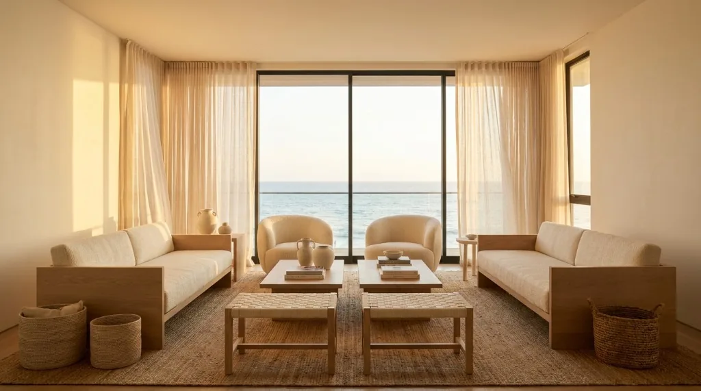
Warm off-white paint colors for west facing living room catching golden afternoon sun
Color Palettes & Aesthetic Harmony

Paint Colors for West Facing Rooms: Neutral Whites, Greiges & Undertones

The best paint colors for west-facing rooms feature neutral-to-cool undertones like soft greiges, muted sage greens, and balanced off-whites. West-facing light shifts from cool morning shade to intense golden-orange sunset rays. Balanced undertones stop walls from glowing harsh yellow in late afternoon. How West-Facing Light Affects Wall Paint Throughout the Day West-facing daylight shifts dramatically…

Read More →