How to Spot Paint Undertones: The Pure White Comparison Trick

Reader Disclosure: This post contains affiliate links. If you buy through them, we may earn a commission at no extra cost to you. We only recommend items tested for clean craftsmanship and authentic durability.
Every neutral paint color contains a hidden mass tone and subtle secondary undertone derived from its pigment mix. To immediately reveal secret undertones on any paint swatch, place the chip directly against a sheet of pure bright white printer paper. The true pink, yellow, green, or blue undertone will instantly become obvious. This quick paper test removes optical guesswork before you buy expensive paint gallons.
Many homeowners experience shock when fresh paint dries on their living room walls. They pick what looks like a sophisticated greige in the store. Once applied across twelve-foot drywall, the room turns into fleshy pink or bruised purple. This nightmare happens because human eyes struggle to isolate color bias without a neutral baseline. Explore our complete guide in the Color Palettes & Styling section to build balanced home palettes.
Before ordering sample pots or rolling paint onto your walls, test digital color codes with our interactive Aesthetic Hex Palette Generator. This tool breaks down RGB values, analyzes pigment bias, and verifies harmonious undertone pairings for your room finishes.
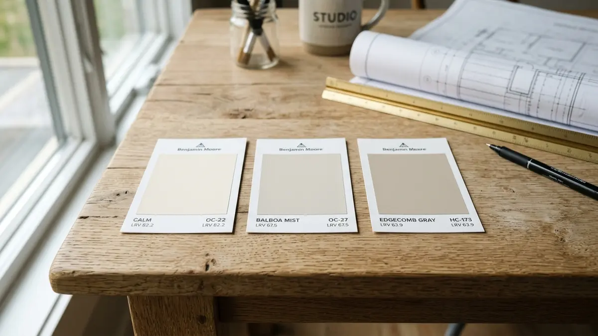
Mass Tone vs Undertone: The Fundamental Color Science
The mass tone is the dominant overarching color you see at first glance, while the undertone is the subtle underlying pigment bias that emerges in natural room lighting. For example, when you look at a beige paint chip, beige is the mass tone. But that beige can carry yellow, pink, or green undertones. Those hidden pigments dictate whether the paint complements or fights your floors.
Paint companies produce neutral shades by mixing multiple colorants into a white base can. A paint mixer adds drops of black, red, yellow, and blue. Even if the resulting paint appears grey to your naked eye, one pigment always dominates the blend. In certain room lighting, that dominant pigment takes over the wall surface.
Why Neutral Paints Are Never Truly Neutral
True achromatic grey contains only pure black and white. Paint brands almost never sell pure achromatic grey for home walls because it feels cold, sterile, and lifeless. It looks like wet industrial concrete. To make grey feel pleasant for residential living, paint chemists add color drops.
Adding a drop of blue creates a cool, modern slate. Adding yellow and black produces an earthy greige. Adding magenta yields a cozy taupe. These color drops give paint its emotional depth. However, they also create sneaky undertones that clash with existing room finishes.
If you pair a pink-undertone greige with a green sofa, the complementary colors fight each other. The contrast draws out the pink, making the wall look like cheap calamine lotion. Identifying the undertone first prevents these costly decorating errors.
The Metamerism Trap: How Artificial Light Shifts Color
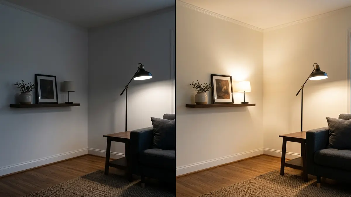
Metamerism describes the optical phenomenon where two colors match under one light source but look completely different under another. This effect explains why paint swatches look perfect in home improvement stores but look terrible inside your house. Commercial store fixtures emit cool, harsh light that masks warm undertones.
When you bring that swatch home under warm 2700K incandescent bulbs, the warm light waves activate red and yellow pigments. The color transforms completely. A cool grey swatch suddenly looks beige, while a warm greige turns peachy.
Always inspect swatches under both daylight and artificial room lamps. Check your swatches at eight in the morning, two in the afternoon, and eight at night. Tracking these lighting shifts ensures your wall color stays handsome through every hour of the day.
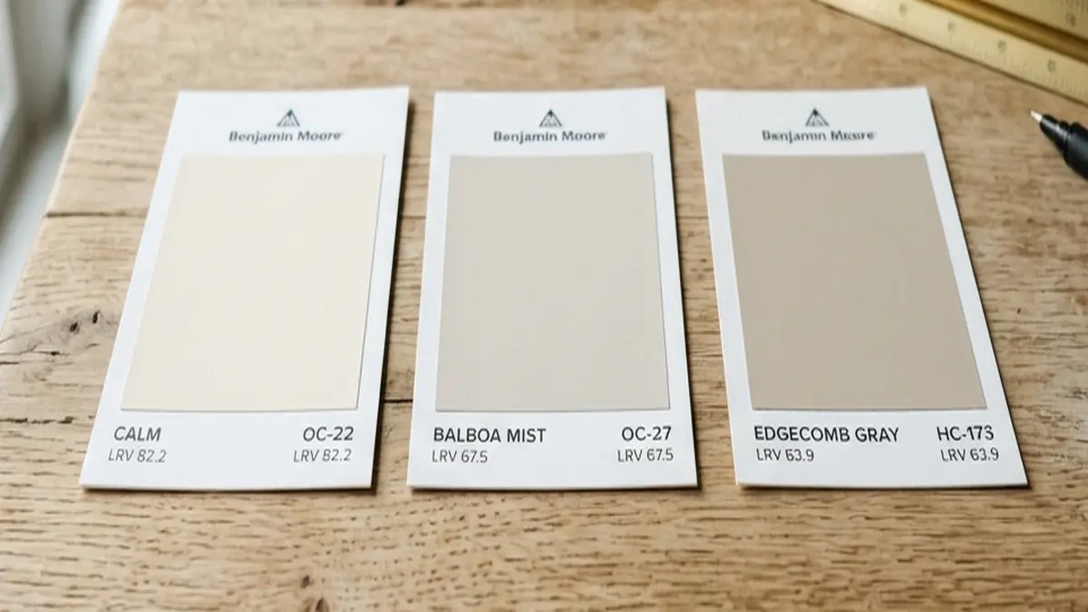
The Pure White Paper Comparison Test
Place your candidate paint swatch flat on a sheet of pure white copy paper; the stark neutral background immediately forces hidden red, green, yellow, or purple undertones into clear contrast. Human eyes adjust to ambient light automatically, which obscures subtle color shifts. Placing a swatch against pure white breaks that optical adaptation and exposes the raw tint.
Standard copy paper has an ultra-high brightness rating of ninety-eight percent with no tint bias. When you drop an off-white paint chip onto this bright sheet, the difference is startling. A swatch you thought was pure white will instantly show its yellow butter, cool blue, or muddy grey pigments.
Step-by-Step Testing Under Daylight and Night Bulbs
Start your test by placing a clean sheet of bright copy paper on a table near your room window. Lay your primary paint chip right in the center of the sheet. Keep other colorful items away from the table to prevent reflected glare.
Look at the outer edges of the paint swatch where it meets the white paper. That border seam reveals the true secondary color. If the edge looks slightly grassy, the paint has a green undertone. If the border looks icy, it has a blue undertone.
Move the paper setup to the darkest corner of the room. Turn on your evening lamps. Check the border seam again under bulb light. This simple two-minute test exposes sneaky undertones before you spend hundreds of dollars on paint cans.
Reading the Darkest Shade at the Bottom of the Strip
Most paint fan decks organize colors on multi-shade strip cards. The top color is the palest tint, while the bottom color is the deepest shade. DIY decorators often study only the top pale chip and ignore the rest of the card. This mistake leads to huge surprises on the wall.
Look directly at the bottom color on the paint card. That dark anchor shade uses the heaviest dose of the exact same colorant formula. If the bottom color looks distinctly olive green, your pale top color contains green undertones. If the bottom color looks chocolate plum, your top shade carries violet-pink.
Use the bottom anchor shade as your decoder ring. It magnifies the hidden pigments so your eyes can identify them without squinting. If you dislike the bottom shade, skip the entire strip.
Identifying Common Neutral Undertones: Pink, Green, Blue, and Yellow
Greiges and whites fall into four primary undertone families: warm taupes have violet-pink undertones, cool greiges feature green undertones, true greys carry blue undertones, and creams have yellow undertones. Knowing these four families helps you choose colors that coordinate with your flooring, cabinetry, and countertops.
Each undertone behaves differently when paired with fixed home finishes. For example, yellow oak floors clash violently with blue-grey walls. The blue and yellow form complementary opposites on the color wheel, making both surfaces look loud and aggressive. Pairing green-based greiges with oak creates a harmonious, organic palette.
The Red/Pink Trap in Warm Taupes
Warm taupes cause more decorating heartbreak than almost any other neutral. Paint makers add red oxide to warm up beige formulas. In small doses, red adds cozy warmth. But in large rooms, especially those with green trees outside the window, the red pigment jumps out.
Green foliage outside reflects green light into your room. That green light triggers the complementary red pigment in the taupe paint. The wall suddenly looks like muddy pink. If you want a warm neutral, test carefully to avoid excessive red tint drops.
To neutralize pink taupe, pair it with crisp white woodwork, black iron hardware, and cool linen upholstery. Avoid pairing pink taupes with yellow wood floors or creamy yellow baseboards.
The Green Undertone Advantage: Earthy and Peaceful
Green-based greiges are the most forgiving neutrals in residential design. Popular shades like Sherwin-Williams Agreeable Gray or Benjamin Moore Edgecomb Gray rely on green-yellow tints balanced by black. These green undertones echo natural outdoor foliage, making the room feel grounded and restful.
Green-grey neutrals pair effortlessly with most hardwood flooring, including white oak, walnut, and natural pine. They absorb sunlight smoothly without turning yellow or purple. They offer an ideal backdrop for transitional and modern organic decor.
Pair green greiges with warm leather furniture, cream wool rugs, and matte black lighting fixtures. The organic palette creates a serene, magazine-worthy living space that stays timeless for years.
Sampling on Walls: Peel-and-Stick Boards vs Wet Paint Swatches
Test paint colors using twelve-inch peel-and-stick real paint sample boards with white borders instead of painting wet patches directly over old wall colors. Brushing wet paint directly onto an existing wall leads to severe visual distortion. The old background color reflects through the wet paint and tricks your eyes.
In addition, small two-inch paint chips cannot show how a color behaves across a large wall plane. A tiny chip gives your brain too little visual data. Peel-and-stick boards provide a full square foot of authentic paint film that you can move around the room.
Why Existing Wall Colors Distort Wet Paint Swatches
The human visual system judges colors through simultaneous contrast. If your current living room wears golden yellow paint, and you paint a cool grey square in the middle of it, the yellow wall will force the grey square to read purple. You might reject a fantastic grey simply because your old wall distorted its appearance.
Peel-and-stick real paint boards feature a white border around the color field. That clean white edge acts as an optical buffer. It blocks the old wall color from corrupting your perception of the new shade. You see the paint color as it will truly appear.
Stick your sample boards on different walls throughout the room. Place one board next to the window casing, one opposite the window, and one beside your floorboards. Observe how the color changes across the day before making your final purchase.
Interactive Tool Integration: Hex Palette & Undertone Generator
Verifying paint formulations requires analyzing digital color values and pigment distributions. To decode your favorite paint choices, explore our interactive Aesthetic Hex Palette Generator. This tool extracts exact RGB ratios and flags hidden undertone biases across hundreds of popular paint codes.
Input your paint manufacturer code or color name into the generator. The software breaks down the digital color curve and reveals whether the formula leans yellow, green, or red. It also recommends matching trim finishes and coordinating flooring tones.
Pairing digital color analysis with physical white paper testing guarantees decorating success. You eliminate paint counter anxiety, protect your renovation budget, and choose harmonious colors on your first attempt.
Paint Undertone Diagnostic and Neutralization Guide
Reviewing undertone classifications confirms that identifying hidden pigment biases before purchasing gallons prevents expensive repainting mistakes and clashing interiors. The following reference matrix details four common neutral undertone groups, identification tricks, clashing hazards, and best material pairings.
| Neutral Category | Hidden Undertone | How to Spot Against White Paper | Severe Clashing Risk | Best Coordinating Materials |
|---|---|---|---|---|
| Warm Taupe / Greige | Pink / Violet Undertone. | Reads slightly rosy or lavender. | Clashes with green carpets and yellow oak floors. | Carrara marble, crisp black accents, cool linen. |
| True Greige | Green Undertone. | Reads soft khaki or olive-tinted grey. | Clashes with purple-toned fabrics or red cherry wood. | Warm white oak floors, brass hardware, warm cream. |
| Cool Grey | Blue Undertone. | Reads icy sky blue or denim. | Clashes with warm golden oak trim and orange tile. | Polished chrome, crisp white trim, navy textiles. |
| Warm White / Cream | Yellow / Ochre Undertone. | Reads warm butter, bisque, or vanilla. | Clashes with cool blue-grey LVP flooring. | Warm walnut, terra cotta tiles, unbleached linen. |
Choose your paint colors by cross-referencing your flooring and trim against this matrix. If your room features honey oak floors, pick green-based greiges to maintain warmth without clashing. If you have cool marble counters, select crisp blue-grey or neutral whites. By honoring undertone rules, you build an interior that feels intentional, balanced, and timeless.
Frequently Asked Questions About Paint Undertones
Direct answers to common reader inquiries regarding paint formulas, color consulting apps, and balancing wood flooring.
What is the easiest way to spot a paint undertone?
Place the paint swatch flat on a sheet of pure white copy paper in natural daylight. The bright neutral white paper immediately forces the hidden pink, yellow, green, or blue undertone to stand out clearly.
Why does my greige paint look purple on the wall?
Your greige paint contains red or violet undertones. When painted in a room with cool north-facing light or next to yellow oak flooring, the contrast exaggerates the red pigments, making the paint look noticeably purple.
How does looking at the bottom of a paint strip help?
The bottom color on a paint swatch strip is the darkest, most saturated shade of that formula. Examining that dark anchor color reveals the dominant parent pigment that exists in subtle amounts in the lighter top colors.
Why should you never paint sample patches directly on the wall?
Painting samples directly on walls distorts your color perception. Your existing wall color bleeds through and visually contrasts with the wet sample, tricking your eyes. Instead, use portable white-bordered peel-and-stick boards.
What is the difference between a warm and cool undertone?
Warm undertones contain yellow, red, orange, or peach pigments, creating an inviting, cozy atmosphere. Cool undertones contain blue, green, or violet pigments, producing a crisp, calm, and airy feeling in living spaces.