Color Drenching Small Rooms: How Painting Everything One Hue Expands Space
Reader Disclosure: This post contains affiliate links. If you buy through them, we may earn a commission at no extra cost to you. We only recommend items tested for clean craftsmanship and authentic durability.
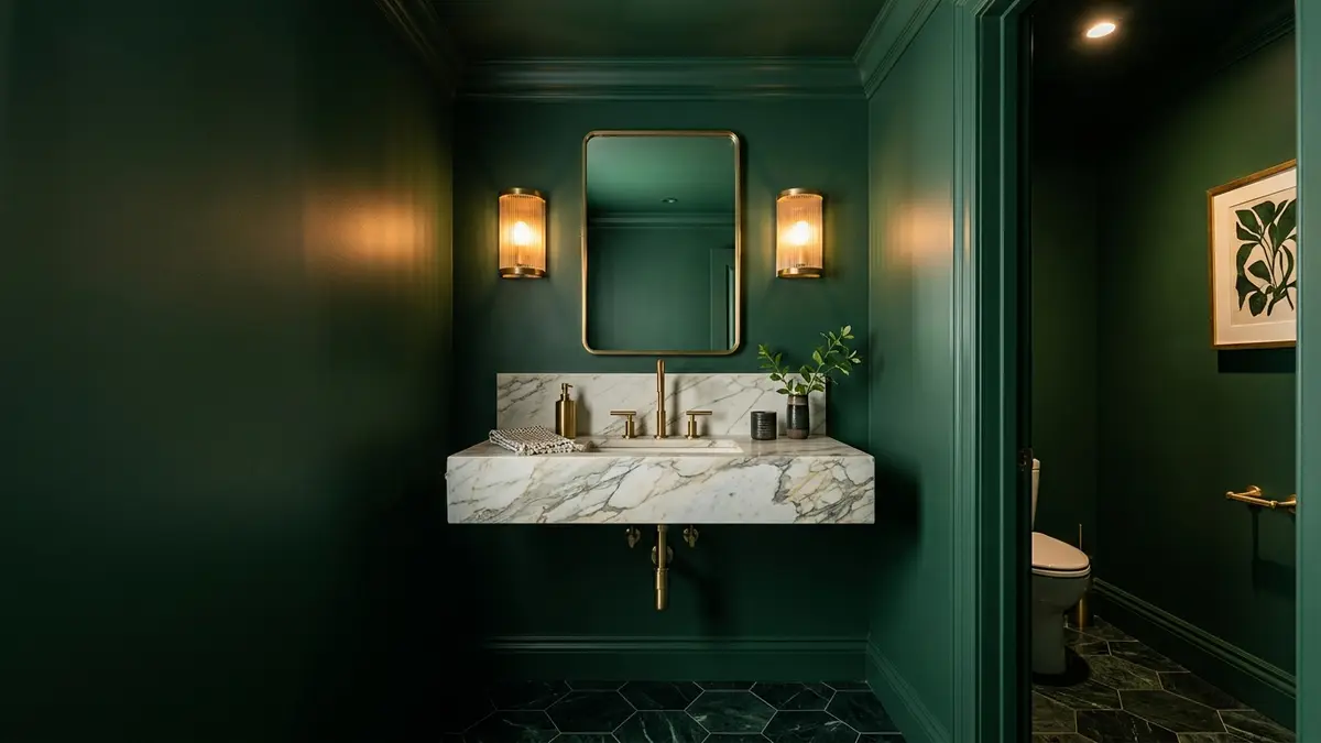
Color drenching is the painting technique of applying a single saturated color across walls, baseboards, doors, window trim, and ceilings. Eliminating high-contrast white trim borders blurs room perimeters. This visual effect tricks the eye into perceiving small spaces as taller, deeper, and more cohesive. It removes choppy visual breaks so compact rooms feel like bespoke, high-end cocoon spaces.
Homeowners often hesitate to use deep paint colors in small spaces. They fear creating a dark, boxy room. Standard decorating advice tells you to paint small rooms stark white. However, plain white paint in a windowless room turns dull and shadowy. Painting walls and woodwork in one rich tone creates intentional drama. It turns cramped powder rooms, small offices, and narrow halls into polished jewel boxes. Explore our complete guide in the Color Palettes & Styling section to build cohesive palettes.
Before buying your paint gallons, test your room lighting and color balances with our interactive Color Rule Palette Generator. This tool helps you test saturation levels, check sheen ratios, and balance accent finishes for your specific square footage.
What Is Color Drenching and Why Does It Expand Small Rooms?
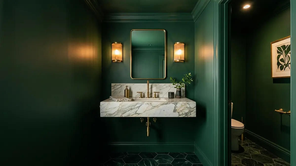
Color drenching coats walls, trim, doors, and ceilings in a single cohesive paint color, eliminating high-contrast borders that divide small rooms and allowing walls to recede visually. Traditional painting methods rely on contrasting white baseboards, white door casings, and white ceilings. In a small room, those white borders outline every corner like a bright box. They highlight the tight limits of the room.
When you remove contrasting trim, human eyes can no longer track where the wall stops and the ceiling starts. The corners soften into gentle shadows. This optical blur makes the boundary planes fade away. Your brain interprets this lack of sharp borders as expansive, continuous space.
The Optical Illusion of Blurred Perimeters
Contrasting trim acts like a ruler across your walls. When bright white crown moulding runs along an eight-foot room, it draws a bold stripe. That stripe reminds anyone entering the room of its low ceiling height. It pins your gaze right at the wall edge.
Color drenching removes that visual ruler. When the ceiling, crown moulding, and wall share the exact same hue, the eye sweeps upward freely. Light grazes across the room surfaces evenly. The ceiling feels lofty and soft instead of heavy and low.
This perimeter-blurring effect works well in rooms with angled ceilings or strange alcoves. Attic bedrooms with sloped dormers often feel cluttered with white trim. Painting the slopes, flat ceilings, and knee walls in one unified tone dissolves awkward quirks into smooth planes.
Why Traditional White Trim Chops Up Small Spaces
Small entryways and narrow hallways frequently contain multiple doors, heating radiators, and electrical panels. If you outline five separate doors with stark white paint, you chop a ten-foot hallway into small pieces. The walls look busy, crowded, and restless.
Drenching those doors, frames, and baseboards in your wall color camouflages utilitarian features. Closet doors and radiator grilles sink directly into the background. The eye focuses on intentional decor pieces, like a framed artwork print or a stylish runner rug, instead of utility doors.
Always paint the door leaf and its casing in the same wall color. Leaving white doors inside a drenched room creates awkward rectangular cutouts. Those white rectangles break the tailored cocoon feeling.
The Sheen Graduation Strategy: Flat Ceilings to Satin Trim
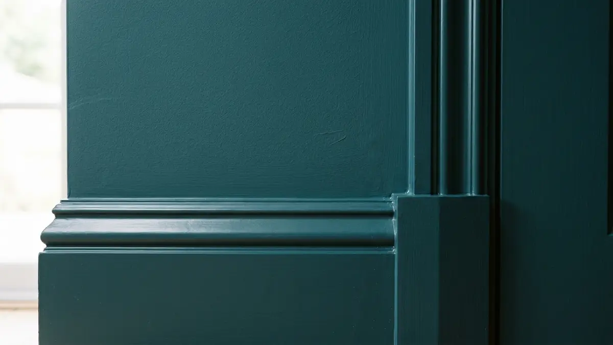
While using the identical paint color throughout, graduate the sheen from dead-flat on ceilings to matte on walls and satin or semi-gloss on doors and baseboards for durability and subtle depth. Using one single sheen level across every surface ruins a color-drenched room. A room painted entirely in high gloss looks like an industrial locker room. On the other hand, full flat paint scuffs easily on baseboards.
Graduating sheens creates tactile interest using texture instead of contrasting pigment. Daylight catches the gentle gloss of the wood trim. It sinks softly into matte plaster walls. This subtle play of light defines your millwork profiles without breaking your unified color palette.
Why You Must Never Use the Same Sheen Everywhere
Ceilings require zero-sheen dead-flat paint. Drywall ceilings contain taped joints, minor dips, and nail heads that remain hidden under flat finishes. If you apply satin or eggshell paint to a ceiling, artificial light bounces off every imperfection. The ceiling glares and looks uneven.
Walls need a durable low-sheen coat like eggshell or washable matte. These finishes absorb ambient glare, hide drywall scuffs, and wipe clean with a damp sponge. They give deep pigments a velvety, rich appearance that flatters small spaces.
Baseboards, doors, and window sills take the brunt of daily foot traffic and shoe kicks. Coat these surfaces in waterborne satin or semi-gloss urethane enamel. The hard enamel resin protects wood edges from chips. It also prevents dark marks from vacuum cleaner bumpers.
Durable Enamels for High-Touch Doors and Mouldings
Specify high-durability acrylic alkyd or waterborne urethane enamels for your trim package. Traditional latex wall paint stays soft and rubbery. It peels off wooden door edges over time. Specialized trim enamels cure into a hard, furniture-grade shell.
Order your wall paint and trim enamel from the same paint brand and dealer. Even when mixing the identical color code, different resin bases can dry with slight tint variations. Ask the paint technician to dry a test dab of both cans side by side on cardstock before you start your project.
Lightly sand existing glossy trim with two-hundred-twenty-grit sandpaper before applying your new drenched color. Sanding scuffs the old gloss. This step helps the new satin enamel bond firmly to the wood substrate without flaking.
Best Colors for Small Room Drenching: Moody Jewels vs Calming Neutrals
Rich jewel tones like deep olive, navy, and aubergine work wonders in windowless powder rooms, while warm greiges and muted sage expand bedrooms with natural light. Picking the right color family depends directly on the natural light entering your space. You must work with the existing light instead of fighting it.
In dark rooms with zero windows, pale neutral paints turn dull and muddy. Saturated jewel tones thrive in low light. They turn the lack of sun into an asset. They create an inviting, cozy atmosphere that feels intentional and tailored.
Windowless Powder Rooms and Small Dens
Powder rooms offer the ideal testing ground for bold color drenching. Guests spend only brief moments in these spaces, which makes high-impact design choices exciting. Coat the walls, ceiling, and trim in deep forest green like Benjamin Moore Salamander. Rich charcoal like Sherwin-Williams Iron Ore also works wonders.
Pair these moody jewel tones with warm metallic accents. Unlacquered brass faucets, gilded mirror frames, and amber lighting pop dramatically against drenched dark backgrounds. The rich green or charcoal walls set off shiny hardware like jewels on dark velvet.
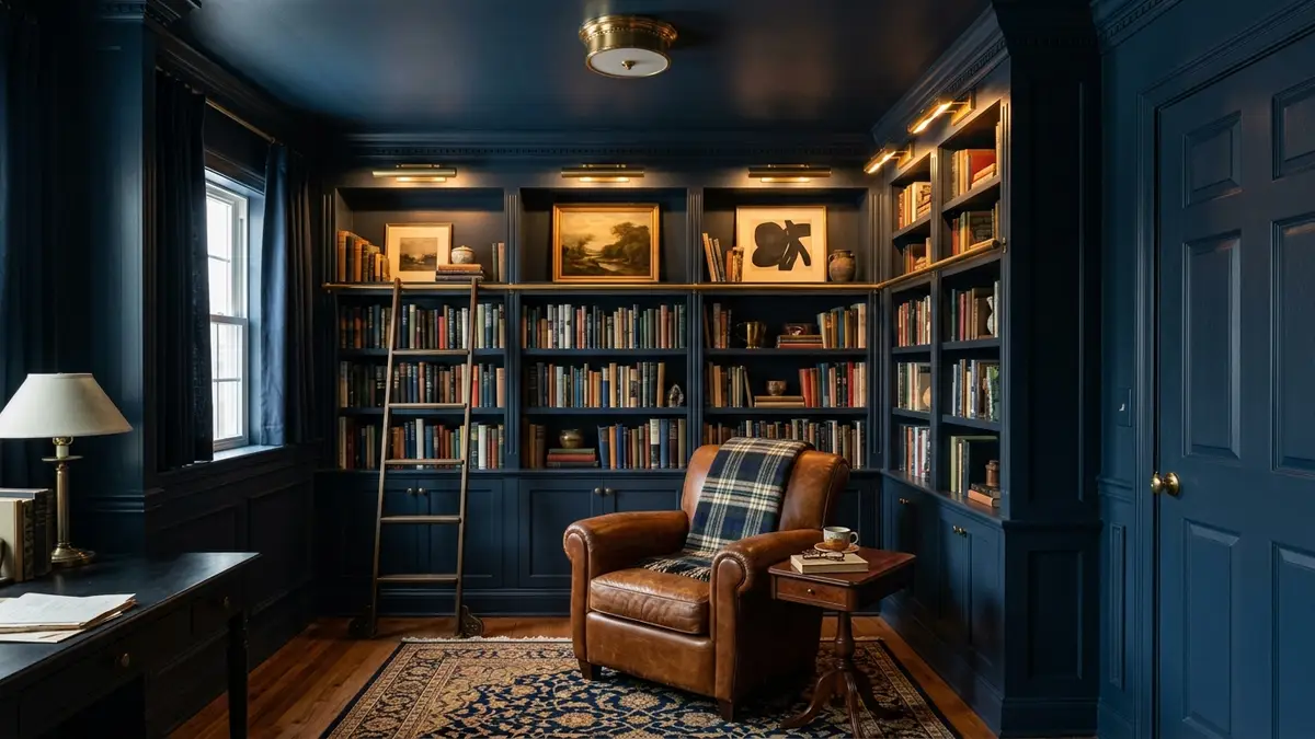
For home libraries or television dens, choose deep navy shades like Benjamin Moore Hale Navy or Farrow & Ball Hague Blue. Dark walls absorb reflections from computer monitors and TV screens. This dark backdrop reduces eye fatigue during movie nights.
Small Bedrooms with Modest Daylight
In small bedrooms where you relax and sleep, softer mid-tones build a calm sanctuary without overwhelming the senses. Choose gentle, earthy hues like warm terracotta, dusty slate blue, or muted herbal sage. Shades like Benjamin Moore October Mist or Sherwin-Williams Redend Point wrap the bed in cozy warmth.
Avoid harsh cool blues that feel clinical in northern morning light. Instead, select paint colors with subtle red, yellow, or grey undertones. These gentle pigments maintain warmth across all seasons. They help your bedroom feel inviting during cold winter mornings.
Layer bedding in neutral linen and cream boucle against the drenched bedroom walls. The textural contrast between soft light textiles and solid painted drywall gives the small room designer-level polish.
Lighting a Color-Drenched Space: Banishing Stark Overheads
Light a color-drenched room using warm 2700K lighting distributed through low table lamps and dimmed wall sconces, avoiding harsh overhead downlights that wash out saturated pigments. Saturated paint colors rely on directional light and soft shadow transitions to show their full depth. A single bright ceiling bulb flattens paint pigments and casts stark downward shadows.
Replace cool daylight bulbs with warm-white LED lamps rated at 2700K. The warm amber spectrum complements deep greens, rich navies, and warm greiges. It enhances the pigment undertones. It also creates a glowing jewel-box atmosphere across the room.
Highlighting Brass and Natural Wood Contrasts
Incorporate unlacquered brass, brushed bronze, and natural timber furniture to break up the monochromatic paint field. A dark walnut desk, caramel leather armchair, or warm oak floating vanity grounds the room with organic warmth. These natural textures keep drenched walls from feeling flat.
Install picture lights above wall art or bookshelves to wash low-wattage light downward over painted millwork. This grazing light catches the wood grain. It also highlights the gentle sheen differences between walls and mouldings.
Put all light switches on electronic dimmer controls. Dimming your lamps allows you to adjust room ambiance from focused daytime reading light to moody evening entertaining glow.
Interactive Tool Integration: Color Palette Generator
Balancing dark paint pigments against furniture tones requires testing undertones under different lighting conditions. To plan your room palette with precision, explore our interactive Color Rule Palette Generator. This tool pairs base wall colors with matching woodwork and accent finishes to verify spatial harmony.
Input your room type, ceiling height, and preferred color family into the generator. The algorithm builds a balanced color scheme with exact sheen recommendations for ceilings, drywall, and doors. It also suggests metallic accents and rug textures that enhance your chosen hue.
Pairing digital color testing with on-site sample boards saves you from repainting mistakes. You buy the right paint sheens on your first trip. You can then execute your color-drenched makeover with confidence.
Color Drenching Color Selection and Room Suitability Matrix
Evaluating color drenching palettes confirms that choosing saturated earthy tones with graduated sheens transforms compact rooms into bespoke luxury spaces. The following comparison matrix details four proven color drenching schemes across room types, color families, paint swatches, and optimal sheen setups.
| Room Type | Recommended Color Family | Popular Paint Swatches | Graduated Sheen Sequence | Resulting Atmosphere |
|---|---|---|---|---|
| Powder Room (Windowless) | Deep Forest Green. | BM Salamander, SW Pewter Green. | Ceiling: Flat; Wall: Matte; Trim: Satin. | Dramatic jewel-box, intimate luxury. |
| Home Office / Library Den | Deep Moody Navy. | SW Naval, BM Hale Navy. | Ceiling: Flat; Wall: Eggshell; Trim: Semi-Gloss. | Focused, studious, immersive. |
| Small Primary Bedroom | Warm Dusty Terracotta. | BM Potter’s Clay, SW Redend Point. | Ceiling: Flat; Wall: Matte; Trim: Satin. | Cozy, cocooning, restful warmth. |
| Compact Entry Hallway | Muted Blue-Grey / Slate. | BM Boothbay Gray, SW De Nimes. | Ceiling: Flat; Wall: Eggshell; Trim: Semi-Gloss. | Sophisticated, expands sightlines. |
Select your palette based on the natural lighting and daily use of your space. In windowless powder rooms, embrace bold dark pigments to build a memorable jewel box. For small offices and bedrooms, choose rich mid-tones that support concentration and rest. By graduating your sheens, you achieve magazine-worthy architectural beauty in any small space.
Frequently Asked Questions About Color Drenching
Does color drenching make a small room look smaller?
No, color drenching actually makes small rooms feel larger. By painting walls, trim, and ceilings the exact same color, you erase contrasting boundary lines. This effect tricks the eye into seeing an expansive, continuous space.
What sheens should you use when color drenching?
Use a graduated sheen system: dead-flat on the ceiling to hide drywall flaws, velvety eggshell or matte on the walls, and durable satin or semi-gloss on baseboards, mouldings, and doors for wipeable protection.
Should doors and radiators be painted when color drenching?
Yes, always paint interior doors, baseboards, heating radiators, and vent covers in the same color. This fully dissolves functional utilitarian hardware into the walls, removing distracting visual breaks across the room.
Can you color drench a room with low ceilings?
Color drenching is particularly effective for low eight-foot ceilings. Without a stark white ceiling line cutting the room horizontally, your eyes travel upward uninterrupted. This makes the ceiling feel significantly taller.
What lighting works best in a color-drenched room?
Use multiple warm 2700K light sources placed at eye level, such as shaded wall sconces, brass table lamps, and floor up-lights on dimmer switches. Avoid harsh overhead lighting that flattens rich paint pigments.