Light Reflectance Value (LRV) Explained: Pick Paint That Brightens Dark Rooms
Reader Disclosure: This post contains affiliate links. If you buy through them, we may earn a commission at no extra cost to you. We only recommend items tested for clean craftsmanship and authentic durability.
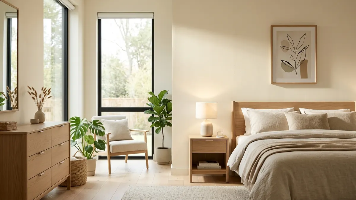
Light Reflectance Value measures the percentage of visible light a paint color reflects on a scale from zero (pure black) to one hundred (pure white). To effectively brighten a dim or north-facing room, you must choose a paint with an LRV of sixty-two or higher that contains warm yellow, ochre, or peachy undertones to counteract cold natural shadows. This exact pairing bounces daylight into dark corners while keeping walls from looking dingy and grey.
Homeowners often buy crisp gallery white paint to cure a dark bedroom. They paint all four walls. Then they step back in shock. Instead of looking bright and clean, the room looks like a cold, shadowy concrete basement. The paint looks dull, gloomy, and flat. In our Color Palettes & Styling guides, we treat paint color as a physical light reflector. Understanding light science protects you from expensive repainting mistakes.
Before you purchase gallons of paint, test your room light balance. Use our interactive LRV Paint Calculator to check window exposures, calculate total room brightness, and find ideal paint reflectance targets tailored to your room layout.
What Is Light Reflectance Value (LRV) and Why Does It Matter?
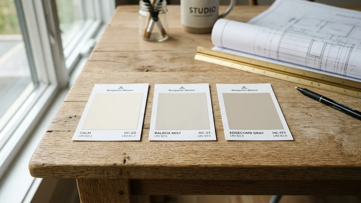
Light Reflectance Value is a standardized universal scale measuring how much ambient illumination a wall paint bounces back into a room versus how much light it absorbs. Paint companies calculate this number under controlled laboratory conditions using spectrophotometer sensors. A paint with an LRV of seventy bounces seventy percent of available light back into your living space. It absorbs only thirty percent of the light energy.
Architects and interior designers rely on LRV numbers to meet green building codes and daylighting standards. High-reflectance paint reduces your need for electric ceiling lights during daytime hours. It cuts power bills while softening room contrasts. Choosing the right LRV turns natural daylight into a functional lighting tool across your home.
The 0-to-100 Scientific Scale Explained
The LRV scale runs from absolute zero to one hundred. A score of zero represents absolute black, which absorbs every single beam of visible light. A score of one hundred represents pure titanium dioxide white, which reflects all light with zero absorption. No commercial wall paint reaches true zero or one hundred in practical residential formulas.
The darkest black paints on the market score between three and five LRV. The brightest pure white trim paints score around eighty-five to eighty-eight LRV. Most popular neutral wall colors cluster between fifty and seventy-five LRV. Knowing where your chosen shade sits on this scale tells you exactly how bright it will feel on your walls.
Where to Find the LRV Number on Commercial Paint Decks
Look at the back of any standard paper paint chip from Sherwin-Williams or Benjamin Moore. Flip the card over. You will find a small printed block listing the color name, color code, and an LRV number. Some fan decks stamp this number directly under the barcode on the back panel.
If you browse paint colors online, check the digital spec sheet. Brand websites list the LRV rating next to the RGB and hex color values. Make note of this number before you order sample pots. Comparing LRV scores takes the guesswork out of store shopping.
Why Pure White Paint Makes Dark Rooms Look Dingy
High-LRV stark white paints require abundant natural light to activate their brightness; in dim rooms with low light levels, pure white has no light to bounce and turns lifeless grey. White paint is not a light bulb. It does not produce illumination on its own. It only reflects the light rays that strike its surface.
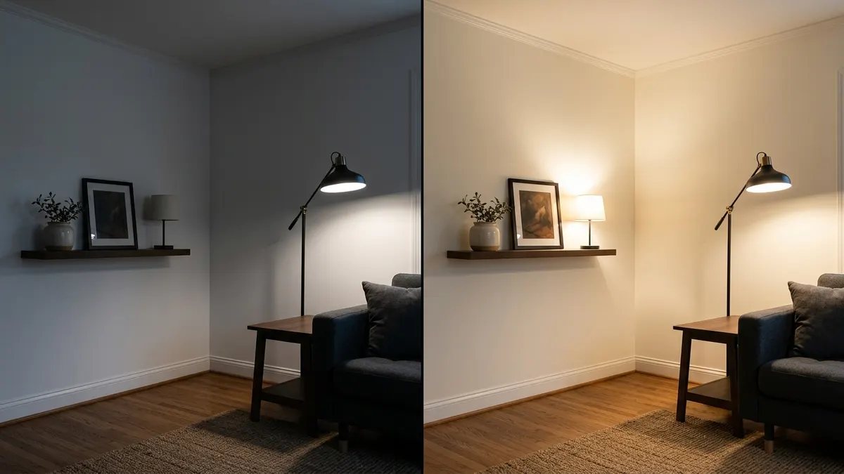
When you coat a dim room in pure white paint, the corners catch dark ambient shadows. Because the paint lacks warm pigment, those shadows read as dirty soot. The room feels sterile, chilly, and uninviting. You end up with a hospital look instead of a bright, cheerful retreat.
The Difference Between Reflecting Light and Creating Warmth
Light reflection and perceived warmth operate through two different optical mechanisms. Light reflection bounces lumens back into the room. Warmth comes from color undertones that trick your eye into feeling comfortable. A paint can have a high LRV of eighty, but if it has cool blue undertones, it feels icy cold in dim rooms.
To fix low-light rooms, choose paints mixed with yellow oxide, red iron, or raw umber tints. These warm mineral pigments absorb cool blue wavelengths. They bounce back soft golden light. A warm cream paint with an LRV of sixty-eight feels ten times brighter and friendlier than an icy white with an LRV of eighty-four.
North-Facing vs South-Facing Light Behavior
Window compass orientation controls the color temperature of your incoming daylight. North-facing windows admit cool, bluish-grey natural light all day long. This cold illumination saps warmth from neutral paints. Cool grey paints in north rooms turn into dull slate. Cool whites turn into gloomy ash.
South-facing windows receive intense, warm golden sunlight from sunrise to sunset. This golden wash flatters almost any color. It can wash out light pastels and turn warm creams into butter yellow. In south-facing spaces, you can use cooler neutrals with lower LRVs to balance the blazing natural warmth.
Recommended LRV Ranges for Every Room Exposure
Choose paint colors with an LRV between sixty-two and seventy-two for dark or north-facing spaces, and an LRV between fifty and sixty-five for sun-drenched south-facing living areas. Matching your paint selection to window orientation prevents shadowy gloom and harsh glare spots. Each wall orientation demands a tailored color strategy.
In east-facing rooms, you enjoy bright warm light in the morning. By afternoon, the light shifts to cool shade. An LRV between sixty and seventy with subtle warm beige undertones balances both halves of the day. West-facing rooms start the morning cool and end the afternoon with blazing orange heat. A muted neutral with an LRV of fifty-eight to sixty-four handles that dramatic evening shift gracefully.
Windowless Powder Rooms and Basement Suites
Windowless powder rooms, basement playrooms, and interior hallways have zero natural light. These spaces rely entirely on artificial light fixtures. Trying to make a windowless powder room look like a sunlit beach house with white paint always falls flat. The walls look chalky under artificial bulbs.
You have two smart design options for windowless spaces. First, you can embrace the lack of light by painting the walls a rich, moody jewel tone like deep navy or forest green with an LRV under twenty. Second, if you want a bright feel, select a warm, luminous bisque or linen paint with an LRV of sixty-six. Pair that warm paint with 3000K LED vanity bulbs to create cozy, flattering illumination.
Living Rooms with Generous South and West Sunlight
Rooms with massive south or west-facing windows flood with strong sunlight. High-LRV whites in these rooms create blinding glare. The walls bounce so much intense light that family members squint while reading or watching television. The room feels hot, restless, and visually exhausting.
Tame intense southern light by picking colors with an LRV between fifty and sixty. Soft greiges, muted sage greens, and stony taupes absorb excess solar glare. They create a calming, grounded mood. The natural sunshine warms the muted pigments without creating harsh, blinding reflections.
How Paint Sheen Interacts with Pigment LRV
While pigment LRV determines total light reflection, higher gloss sheens increase specular reflection. High-gloss finishes show drywall bumps and create harsh glare spots under artificial lighting. Paint sheen describes the gloss level of dried resin on the wall. A flat paint and a semi-gloss paint mixed with the exact same color formula share the exact same chemical LRV rating. Yet they look completely different under room lights.
Flat and matte sheens scatter light rays in all directions. This diffuse scattering creates a velvety, smooth appearance that hides drywall tape seams and patch marks. High-gloss sheens bounce light rays in a tight, concentrated beam like a mirror. That mirror reflection creates shiny flash spots that wash out wall color.
Matte vs Eggshell vs Satin Sheen Behavior
Eggshell finish provides the sweet spot for residential living rooms and bedrooms. It has just enough soft sheen to resist stains and wipe clean with a damp cloth. Yet it diffuses light softly across the wall plane without creating distracting shine lines under floor lamps.
Reserve satin and semi-gloss finishes for interior doors, window sashes, and baseboard moldings. High-sheen trim creates crisp architectural contrast against softer eggshell walls. Keep ceilings strictly in flat dead-matte paint. A flat white ceiling absorbs glancing ceiling light, hiding framing joist shadows overhead.
Testing Room Light with the LRV Paint Calculator
Never pick wall colors under the harsh fluorescent lights of a home improvement store. Fluorescent store tubes distort paint pigments. Take peel-and-stick sample squares home. Place one sample on every wall in your room.
Our interactive LRV Paint Calculator helps you predict light behavior before you open a paint can. Enter your room dimensions, window directions, and desired brightness level to identify the exact LRV sweet spot for your home.
Watch your paint samples over a full twenty-four-hour cycle. Check them at eight in the morning, two in the afternoon, and eight at night under artificial lamps. Observing color shifts across daylight cycles guarantees you will love your final wall finish.
Paint LRV Ranges and Room Exposure Guide Matrix
Reviewing light reflectance data proves that matching paint LRVs to specific compass exposures prevents dreary room shadows and harsh reflective glare. Different window directions alter color pigments dramatically throughout the day. Match your room orientation to the tested recommendations in the color matrix below.
Compass Orientation, Natural Light Level, and Ideal LRV Targets
Use the structured reference data below to pick your target LRV range, choose complementary undertones, and select proven paint formulas for your home.
| Room Compass Exposure | Natural Daylight Quality | Recommended LRV Range | Recommended Undertones | Popular Paint Examples |
|---|---|---|---|---|
| North-Facing Rooms. | Cool, soft, bluish-grey light all day. | LRV 62 to 72 (medium-high). | Warm cream, yellow, peach, soft beige. | BM Swiss Coffee, SW Alabaster. |
| South-Facing Rooms. | Intense, warm, golden sunlight all day. | LRV 50 to 65 (medium). | Cool grey, subtle green, neutral greige. | BM Classic Gray, SW Repose Gray. |
| East-Facing Rooms. | Bright warm morning, cool dim afternoon. | LRV 60 to 70 (balanced). | Soft warm neutral, warm linen white. | BM White Dove, SW Greek Villa. |
| West-Facing Rooms. | Cool dull morning, intense golden evening. | LRV 55 to 65 (moderate). | Balanced neutral, muted sage or taupe. | BM Pale Oak, SW Accessible Beige. |
| Windowless Rooms. | Zero natural light, purely artificial bulbs. | LRV 65 to 72 or under 20. | Warm bisque, creamy linen, deep navy. | BM Linen White, SW Naval. |
Check your chosen paint formulas with physical sample cards before buying gallons. Balancing pigment LRV with your room compass orientation creates luminous, inviting living spaces. Spending twenty minutes studying light reflectance guarantees picture-perfect walls that brighten your daily life.
Frequently Asked Questions About Paint LRV
Direct answers to common homeowner inquiries clarify paint reflectance numbers, dark room solutions, sheen impacts, and swatch reading techniques.
What LRV paint is best for a dark room?
For a dark room, choose a paint color with an LRV between sixty-two and seventy-two that contains warm yellow or cream undertones. Avoid stark cool whites, which turn gloomy and dingy in dim light.
What does a higher LRV number mean?
A higher Light Reflectance Value means the paint reflects more light and absorbs less. Pure black has an LRV of zero, while pure titanium white has an LRV approaching one hundred.
Can you use high LRV paint in a south-facing room?
You can, but paint with an LRV over seventy-five in a sun-drenched south-facing room can cause blinding eye glare during peak afternoon hours. Medium LRVs between fifty-five and sixty-five feel softer and more restful.
Does paint sheen change the LRV?
The official LRV measures pigment color reflection and does not change with sheen. However, glossier sheens create specular highlight reflection, bouncing light directionally and making colors appear slightly lighter than flat finishes.
Where is the LRV listed on a paint swatch?
Most major paint manufacturers like Benjamin Moore and Sherwin-Williams print the LRV number clearly on the back of paper paint swatches or beneath the color formula on their official brand websites.