60-30-10 Color Rule Bedroom Application: 5 Steps
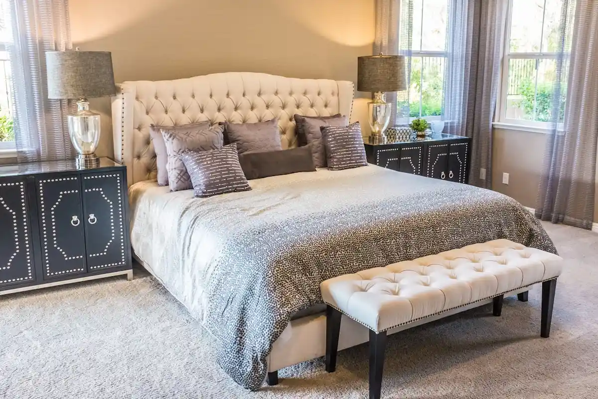
Applying the 60-30-10 color rule bedroom application requires allocating sixty percent of the room to a restful dominant background hue across walls, ceiling, and large area rugs. Reserve thirty percent for tactile secondary grounding elements like duvet covers, upholstered headboards, and floor-length drapery. Dedicate the final ten percent to intentional accent colors through throw pillows, bedside ceramic lamps, and framed art.
While the 60-30-10 rule works well in living rooms, transferring those high-contrast palettes directly into bedrooms disrupts sleep hygiene. Living rooms benefit from energetic contrasts and bold pattern mixes that stimulate social interaction. Bedrooms require lower chromatic contrast and higher tactile texture to encourage deep circadian rest. When bedroom colors fight for attention, your visual system stays alert, which delays evening relaxation.
Adapting this classic decorating formula for the bedroom requires you to understand how the bed functions as the central visual anchor. In living spaces, furniture distributes across multiple seating zones. In the bedroom, the bed claims up to one-third of the floor footprint and dominates the horizontal eyeline. Before you purchase linens or paint gallons, use our interactive 60-30-10 Color Rule Palette Generator to test sleep-supporting color ratios against your natural bedroom light.
60-30-10 Color Rule Bedroom Application: How Palette Ratios Differ
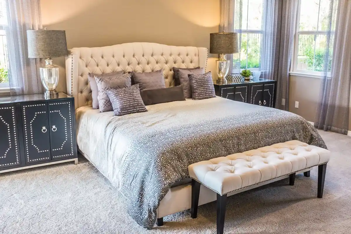
The bedroom adaptation of the 60-30-10 rule differs from living room applications because the bedding ensemble replaces upholstery as the primary thirty percent visual anchor. This horizontal surface demands lower chromatic contrast and richer tactile texture to encourage circadian rest. By softening tonal shifts between dominant walls and secondary bedding, you create an envelope of restorative calm.
In living rooms, thirty percent covers sectionals and armchairs. In bedrooms, the bed dominates horizontally as the main architectural feature. If your thirty percent duvet and sixty percent wall paint clash with intense contrast, the bed appears disconnected from the architecture. Successful bedroom color planning connects the bed to surrounding walls through tonal harmony and shared warm undertones.
Apply these core bedroom color principles to optimize relaxation across your private sanctuary:
- Lower Chromatic Contrast: Keep the color distance between your sixty percent walls and thirty percent bedding within two steps on a tonal paint strip. Gentle tonal transitions calm ocular focus and signal nighttime wind-down.
- Tactile Texture Substitution: Rely on rich textures instead of loud color contrasts to build visual interest. Layer washed French linen, chunky waffle knits, and bouclé wool in matching tones to create tactile depth without visual clutter.
- Muted Accent Selection: Select ten percent accent shades that possess gray or brown undertones. Terracotta, dusty slate, antique brass, and sage green introduce warmth without stimulating alert daytime responses.
Step 1: Anchor the 60% Restful Dominant Canvas (Walls, Ceilings & Large Rugs)
The sixty percent dominant color establishes the foundational mood of your bedroom, applied across the largest architectural planes including drywall paint, ceiling paint, and large bedroom area rugs that extend beneath the bed frame. Selecting low-saturation, matte wall finishes creates a cocooning backdrop that minimizes light glare and promotes visual stillness.
Covering the majority of square footage, the sixty percent requires careful sheen selection. Glossy paint reflects glare from bedside lamps and window exposures. Always specify flat or matte finishes on ceilings, and eggshell or low-sheen velvet matte on perimeter walls. Low-sheen finishes diffuse light gently across drywall surfaces. This flat finish conceals drywall imperfections and enhances room tranquility.
Execute your dominant sixty percent backdrop with these architectural guidelines:
- Wall Surface Dominance: Coat all four perimeter walls in your foundational tone. Soft warm whites, gentle greiges, muted sage, or deep moody charcoals provide a cohesive envelope. In compact floor plans, you can apply our expert strategies on how to make a small bedroom feel bigger to prevent dark or saturated wall tones from cramping your space.
- Ceiling Integration: Paint the ceiling in a tinted version of your wall color instead of standard stark contractor white. Diluting your wall formulation creates a seamless overhead transition. Review our full breakdown on the ceiling paint flat white vs half-strength formula to calibrate overhead value balance accurately.
- Foundation Area Rugs: Lay down an oversized area rug that extends at least twenty-four to thirty-six inches beyond the bed sides and footboard. Choose a rug color that harmonizes with your wall paint. This textile layer absorbs acoustic flutter echoes and secures the sixty percent dominant color foundation across your flooring plane.
- Light Reflectance Value (LRV) Control: Select wall paints with an LRV between 60 and 75 for light airy bedrooms, or between 10 and 25 for moody cocooning retreats. Consult our Light Reflectance Value (LRV) paint guide to calculate exactly how your wall paint will interact with available window exposures.
Step 2: Layer the 30% Tactile Secondary Midtones (Bedding, Headboards & Drapes)
The thirty percent secondary layer introduces functional warmth and tactile grounding, concentrated across the main bedding setup, upholstered headboard, and floor-length drapery panels. This midtone layer bridges dominant wall expanses with small accent items. It anchors the bed as an intentional focal sanctuary and preserves overall tonal unity.
The thirty percent bridges the background and accent touches. Because the bed is the first element you see, balanced color distribution across your duvet and shams determines whether the room feels tailored. Conflicting colors across sheets and duvets fragment the bed plane into disorienting color blocks. Unify your primary bedding pieces under one consistent midtone hue.
Structure your secondary thirty percent elements with these styling strategies:
- The Main Duvet Anchor: Select a solid or softly heathered duvet cover that embodies your thirty percent selection. If your walls are warm ivory, a washed linen duvet in soft oat, taupe, or weathered slate anchors the bed with quiet authority.
- Upholstered Headboards: Choose headboard fabric that matches or sits one shade darker than your duvet. A channel-tufted or slipcovered headboard in textured linen, boucle, or brushed velvet provides comfortable back support and extends your thirty percent tone vertically against the wall.
- Floor-Length Drapery: Mount curtain rods four to six inches above the window casing. Hang drapery panels so they touch or lightly kiss the floor. Matching your drapery fabric to your bedding tone carries the thirty percent color across the room perimeter. This placement creates spatial balance.
Step 3: Inject the 10% Intentional Accent Energy (Bedside Lighting, Pillows & Decor)
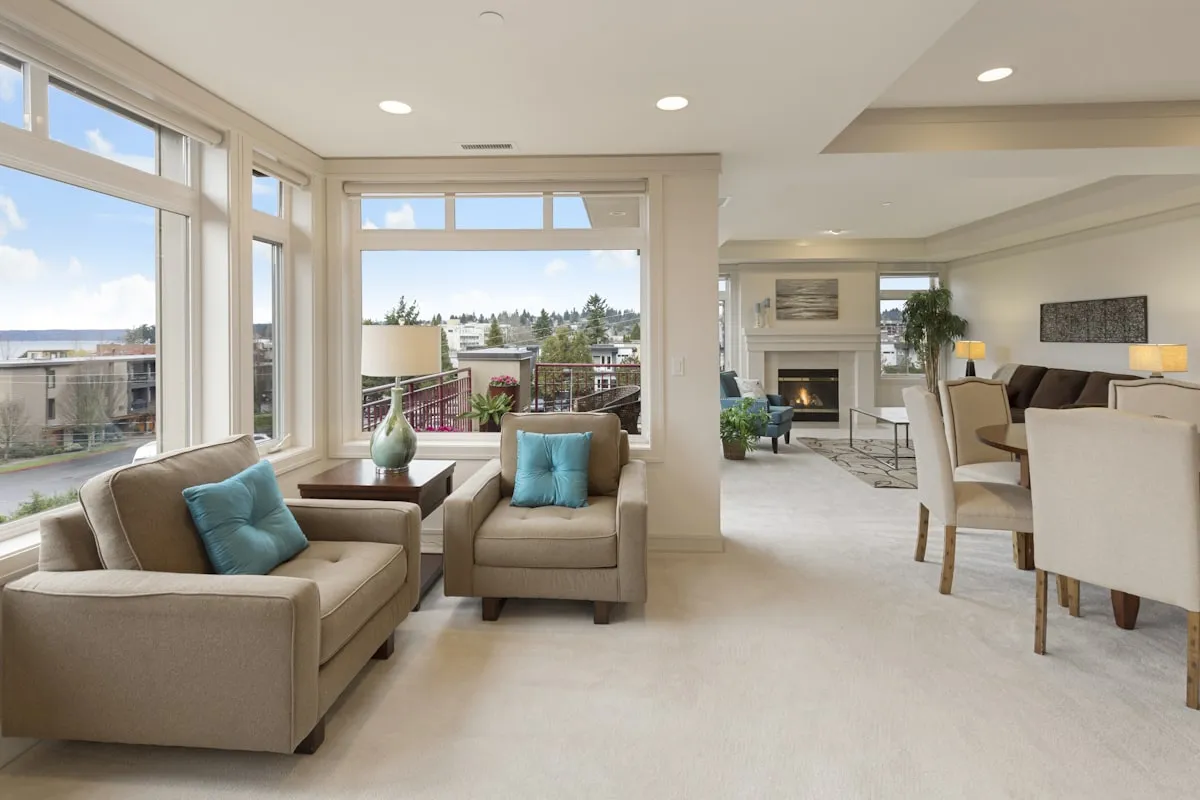
The ten percent accent allocation delivers personality, focal contrast, and energy, expressed through one or two focused secondary colors in decorative throw pillows, bedside lamp bases, framed art, and metallic hardware. Restricting accent colors to small decorative objects prevents visual overstimulation while preventing serene bedroom palettes from feeling flat or sterile.
It is easy to overdo the ten percent accent. Scattering accessories in multiple colors across dressers and cushions creates visual clutter that distracts your eyes before sleep. In bedrooms, the ten percent serves as a punctuation mark. It draws focus without disrupting peaceful rest. Distribute this accent color across three distinct physical points around the room to establish visual rhythm.
Incorporate your ten percent accents using these styling techniques:
- Curated Bed Pillows:
Use two matching lumbar pillows or one long lumbar pillow in your accent tone placed in front of your sleeping pillows. Woven textures like velvet, wool plaid, or embroidered linen give accent colors rich substance. - Bedside Accent Lighting:
Introduce your accent color through ceramic, blown glass, or metal table lamps and wall sconces. Install wall fixtures following our precise bedside reading sconce height guidelines to align task lighting with your mattress surface. Pair this layout with proper furniture scale by checking nightstand height compared to mattress top for seamless bedside ergonomics. - Warm Metallic Hardware:
Count cabinet knobs, door handles, and lamp stems as part of your ten percent allocation. Brushed brass, oil-rubbed bronze, or matte black hardware creates crisp outlines that bring definition to painted nightstands and dressers. - Framed Artwork Accents:
Choose wall art that contains flecks of your accent color alongside your sixty and thirty percent background tones. A canvas or matted photograph that unites all three palette colors ties your decor together effortlessly.
Step 4: Calibrate 2700K Warm Lighting for Circadian Color Fidelity
Lighting temperature directly determines how your bedroom color palette appears at night. The success of the 60-30-10 color rule depends on installing 2700 Kelvin warm white bulbs with a Color Rendering Index of 90 or above. Warm lighting softens dominant walls, enriches bedding textures, and shields melatonin production from sleep-disrupting blue wavelengths.
First, install warm white 2700 Kelvin LED bulbs with a high Color Rendering Index (CRI) rating of ninety or above for all primary bedroom fixtures. Standard contractor-grade LED bulbs with a low CRI rating below eighty dull rich tertiary wall paint undertones. Poor bulbs make warm clay, sage, and oatmeal shades look flat and lifeless. A ninety-plus CRI rating reproduces genuine color pigments faithfully under artificial evening illumination.
Second, avoid cool daylight bulbs rated at 4000 Kelvin or 5000 Kelvin in sleep environments. High color temperature lighting emits sharp blue spikes that suppress natural melatonin secretion. Cool light washes out subtle sixty percent wall shades. This harsh glare creates an institutional atmosphere that delays melatonin release.
Third, introduce warm 2200 Kelvin amber filament bulbs in low-wattage reading lamps and nightstand sconces. This ultra-warm light mimics gentle candle flame or late sunset glow. Amber lighting warms thirty percent textured linen duvets. This soft spectrum eases your visual system into deep evening comfort without distorting your room color balance.
Fourth, harmonize wood furniture finishes with your sixty and thirty percent color foundations. Light blonde Scandinavian oak compliments cool white and sage backdrops, while deep walnut furniture grounds warm beige and terracotta schemes. Consistent wood undertones prevent visual discord across dressers, nightstands, and bed frames.
Fifth, test fabric swatches under both daylight and artificial bedside lighting before finalizing large bedroom textile orders. Bedding materials shift color dramatically under different illumination angles. Viewing your sixty, thirty, and ten percent swatches together under your actual 2700K bedside lamps ensures your palette retains perfect harmony after sundown.
Step 5: Implement the Bedroom Color Distribution Matrix (4 Curated Sleep Palettes)
The four most effective sleep-promoting color palettes for bedrooms are warm organic neutral, coastal mist, moody forest retreat, and earthy French country. Each curated scheme divides surfaces into balanced ratios that minimize visual stimulation, maintain circadian harmony, and provide timeless bedroom elegance.
Creating a balanced bedroom palette requires harmonizing cool receding tones with warm grounding accents. When dominant surfaces remain neutral, secondary bedding pieces and accent objects introduce personality without overwhelming your senses. Review this curated distribution matrix to select a harmonious formula for your bedroom retreat:
| Design Aesthetic | 60% Dominant (Walls & Floor) | 30% Secondary (Bedding & Drapes) | 10% Accent (Lamps & Pillows) | Atmospheric Result |
|---|---|---|---|---|
| Warm Organic Neutral | Alabaster White & Jute Rug | Oatmeal Washed Linen & Camel Headboard | Brushed Brass & Terracotta Velvet | Serene, grounded, natural tactile comfort |
| Coastal Mist | Pale Fog Gray & Bleached Sisal | Muted Sea Salt Sage & White Gauze Curtains | Matte Black Iron & Deep Indigo Pillows | Airy, restorative, subtle coastal calm |
| Moody Forest Retreat | Deep Slate Charcoal & Dark Oak | Olive Moss Velvet & Heather Wool Throw | Warm Ochre & Amber Glass Bedside Lamps | Cocooning, warm, deep evening calm |
| Earthy French Country | Creamy Warm Taupe & Natural French Oak | Faded Chambray Blue & Striped Dust Ruffle | Antique Pewter & Dried Lavender Florals | Romantic, timeless, understated warmth |
Notice how each palette restricts bold or darker tones strictly to the ten percent accent allocation. Restricting saturation to minor accents protects the peaceful atmosphere necessary for uninterrupted sleep. When evaluating your base wall colors, check our tutorial on how to read paint undertones on swatches to identify hidden pink, blue, or yellow pigments before rolling paint onto bedroom drywall.
By dividing your bedroom surfaces into a calm sixty percent dominant envelope, a tactile thirty percent bedding anchor, and a ten percent accent highlight, you eliminate guesswork from bedroom styling. This structured ratio ensures your private sanctuary remains balanced, restful, and visually inspiring for years to come.
Consult the Pantone Color Institute harmony principles for verified technical documentation, safety codes, and official industry standards on color balance.
Frequently Asked Questions About the 60-30-10 Bedroom Color Rule
What is the 60-30-10 color rule in interior design?
The 60-30-10 color rule is a classic interior decorating guideline that divides a room palette into sixty percent dominant background color, thirty percent secondary color or texture, and ten percent accent color. This proportional formula creates visual balance and prevents rooms from feeling chaotic or stark.
How do you calculate the 60 percent color in a bedroom?
Calculate the sixty percent dominant color by assessing the largest continuous surface planes in the room. This includes all four perimeter walls, the ceiling, and large area rugs that cover the majority of the floor. In bedrooms, this background envelope anchors the visual space.
Can white be the dominant 60 percent color in a bedroom?
Yes, white works well as a dominant sixty percent color when you choose warm, soft off-whites with yellow or green undertones. Avoid stark, cold clinical whites with blue undertones, which can feel harsh and inhibit evening relaxation.
What counts as the 30 percent secondary color in a bedroom?
The thirty percent secondary color is primarily concentrated across the main bed setup, including duvet covers, coverlets, and upholstered headboards. Floor-length window drapery and secondary accent chairs also contribute to this midtone layer.
How many accent colors can you have in the 10 percent?
Limit the ten percent accent allocation to one primary accent color, or split it into two closely related companion tones. Incorporating more than two accent shades fragments the space and creates visual clutter that distracts from rest.
Does the 60-30-10 rule work in small master bedrooms?
Yes, the rule is especially effective in small bedrooms because it eliminates visual clutter. Selecting low-contrast shades for the sixty and thirty percent makes tight bedrooms feel spacious, cohesive, and serene.