Warm Neutral Paint Colors for Dark Rooms: 5 Picks
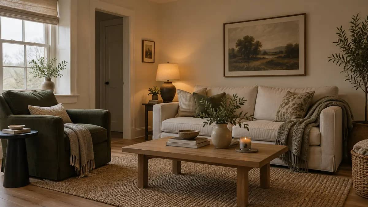
Swiss Coffee and Alabaster are useful warm neutral paint colors for dark rooms when you want light walls. Try Pale Oak or Ballet White for more visible color, and Accessible Beige for a deeper finish. Match samples to your floor and evening lamps before you choose a whole-room paint.
This shortlist compares manufacturer color data with practical room choices. It does not claim hands-on testing. A high light reflectance value helps a surface reflect available light, but paint cannot supply missing daylight. Your lamps still matter. All room images here are AI-generated illustrations, not exact branded paint samples.
Which warm neutral paint colors should you sample first?
Sample Swiss Coffee or Alabaster first for an off-white room. Choose Pale Oak if you prefer warm gray, or Ballet White for a soft off-white with more depth. Accessible Beige suits a room where you want stronger wall color and accept a less light-reflective finish, especially after sunset.
| Paint and code | LRV, rounded | Starting point | Check before buying |
|---|---|---|---|
| Benjamin Moore Swiss Coffee OC-45 | 82 | Warm off-white walls | Warmth beside existing white trim |
| Sherwin-Williams Alabaster SW 7008 | 82 | Soft white background | Creaminess under evening lamps |
| Benjamin Moore Pale Oak OC-20 | 69 | Light warm gray | Gray cast beside your flooring |
| Benjamin Moore Ballet White OC-9 | 72 | Off-white with more depth | Contrast with pale upholstery |
| Sherwin-Williams Accessible Beige SW 7036 | 58 | Deeper beige walls | Darkness in corners and alcoves |
The rounded numbers help you compare lightness. They don’t rank quality or predict how bright your room will feel. The product links below identify each manufacturer and formula. Paints from different brands can share a name, so take the code with you to the store.
Choose two candidates with a clear difference. Five near-identical whites can leave you comparing tiny shifts for days. One off-white beside one deeper neutral tells you more about the room you want.
Swiss Coffee OC-45 for a warm off-white room
Benjamin Moore Swiss Coffee has an LRV of 81.91. The brand also includes it in its north-facing room guidance. It is a sensible first sample when plain white walls feel too cold and you still want a light background.
Put the sample beside your permanent trim. A cabinet door that looks white on its own may make the wall sample appear creamier. Keep both in view from the doorway. If that contrast bothers you now, it will cover much more space after you paint.
Try it with the wood furniture you already own. Don’t order a new sofa just to make a sample work. Your largest fixed surfaces should set the limits for your shortlist.
Alabaster SW 7008 for soft white walls
Sherwin-Williams Alabaster has a manufacturer LRV of about 82. That puts it close to Swiss Coffee in light reflection, but the two colors can look different beside your trim. Choose between them through samples, not a small numerical gap.
Compare Alabaster under the lamps you use for an ordinary evening. A cream shade can appear warmer beneath a yellow-toned lampshade. Hold a piece of your curtain fabric next to it too. Pale textiles occupy enough space to affect how you judge a near-white wall.
If you plan to paint the trim as well, test the same color in your chosen trim finish. Different sheens can create enough contrast without a second white. Leave the original trim visible during the trial so you can compare both options.
Pale Oak OC-20 when white feels too bare
Pale Oak from Benjamin Moore has warm gray undertones and an LRV of 68.64. Sample it when you want a light neutral with more visible depth than the two whites above. Expect the room’s shadowed side to show that depth most clearly.
A gray floor needs special attention here. Place the board low enough to see it against the flooring, then raise it beside the sofa. Reject the shade if either pairing creates a cast you dislike. Our paint guide for gray floors helps you compare those fixed surfaces.
Pale Oak belongs on the shortlist for someone who likes gray. If your main complaint is that every gray sample looks dull, begin with a warmer off-white instead. A familiar paint name won’t change your taste.
Ballet White OC-9 for an off-white with depth
Benjamin Moore Ballet White sits at 71.97 LRV. Consider it if Swiss Coffee looks too close to your ceiling but you want less depth than a midtone beige. Its position between white and deeper neutrals makes that comparison useful.
Set a sample behind an ivory cushion and beside a darker wood piece. Check whether the wall still gives the pale fabric enough definition. Two almost-matching pale surfaces can look accidental when their colors differ slightly.
Keep a physical sample of your trim nearby. Benjamin Moore lists White Dove as a coordinating option, which gives you a starting point if you intend to repaint woodwork. Your actual finishes should decide the pairing.
Accessible Beige SW 7036 for a deeper wall color
Sherwin-Williams Accessible Beige has an LRV of about 58. It reflects less light than the other choices here. Pick it for a more enclosed feel when you like beige walls and have lamps where you sit, read, or move through the room.
Test the recess beside a chimney breast or tall bookcase. That patch can look much darker than the open wall opposite a window. If you dislike the sample there, choose a lighter paint before you buy gallons.
You don’t need a particular bulb temperature to make this color work. Judge the paint with lighting that suits your eyes and daily use. A warm lamp may change its appearance, but it won’t make every dark corner equally bright.
Why do warm neutral paint colors change in low light?
These colors shift in appearance because daylight, lamps, and nearby surfaces affect the light that reaches your eyes. A north-facing room often receives cooler indirect daylight in the Northern Hemisphere. A room shaded by buildings can behave differently, so window direction alone cannot predict the final wall color.
Sherwin-Williams explains room orientation as one part of color selection. Use the hours you occupy the room as your main test. A living room that looks lovely at noon still needs to suit you after dinner.
Separate warmth from brightness. Warm describes the color impression; brightness also depends on the light available. You can have a warm room with dim corners, or a bright space with cool white walls. Neither condition proves that the paint formula is wrong.
Look outside as well. A brick wall, dense trees, or a deep porch may affect the light near your window. Compare the same sample at both ends of the room. That simple move can explain more than a new batch of paint chips.
Use our room light and paint undertone finder for initial color suggestions. Then take those ideas to your sample boards. An online tool cannot measure the reflected light or fixed finishes inside your home.
What LRV works best for a dark living room?
An LRV of 60 or higher is a useful starting point if your aim is lighter-looking walls. Warm off-whites around 80 offer more light reflection than beige shades near 60. Treat this as a screening guide, then check actual samples because LRV does not account for your lamps or layout.
Sherwin-Williams suggests 60 LRV or higher for north-facing rooms. Accessible Beige falls below that starting point. It remains an option for a deeper scheme, but it should not carry a promise to brighten a dim room.
Our LRV and room brightness guide explains the scale in more detail. For this shortlist, decide whether you want the walls to look nearly white or clearly colored. That choice narrows your samples faster than chasing one ideal number.
How should you test paint before buying gallons?
Test two large samples beside your trim, floor, and sofa, then move them across all four walls. Check daylight and your normal evening lighting before choosing. Use the same sample position for each comparison, and give the darkest corner its own check so a bright window does not decide everything.
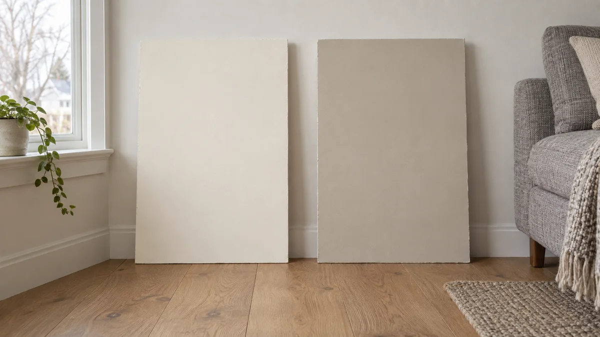
- Prepare a movable board at least 12 inches square for each color. Follow the sample paint’s coat and drying directions. Leave a white margin to reduce distraction from the existing wall.
- Hold each dry board upright against the same wall. Keep it next to the trim for one check, then beside the floor. Use normal viewing distance as well as a close look.
- Move the boards to the window wall, opposite wall, and both side walls. Note any corner where a sample looks too gray, yellow, or dark for your taste.
- Recheck on an evening when you use the room normally. Turn on your usual lamps and sit in your usual seat. Choose from that view as well as the doorway.
Write short notes such as “too cream beside cabinet” or “good behind sofa.” Phone cameras adjust exposure and white balance, so keep written observations alongside photos. Trust what you see in the room over a brighter phone image.
Before the full job, confirm a small area in the actual paint line and sheen you intend to buy. Sample products may use a different finish. Follow the label’s drying time before judging that final patch.
Which trim and lighting suit warm neutral walls?
Pair warm neutral walls with trim that looks compatible in the same light, and place lamps near the areas you use. A matching trim color can soften edges; a lighter white adds definition. Test both finishes together because a glossy surface can look different even when the color name matches.
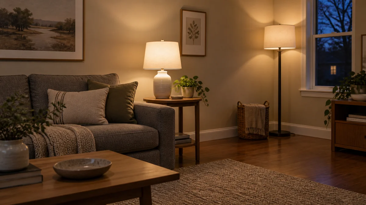
Start with the trim you plan to keep. Replacing a wall color costs less effort than repainting every door because two whites clash. If you want stronger edges, compare options in our lighter versus darker trim guide.
A single ceiling light may leave the seating area uneven. Try a lamp near the sofa and another near the opposite corner. Choose output for the task and check the result from your chair. Adjust the lamps before rejecting every paint sample.
Keep ceiling decisions separate from improvised tint recipes. Asking for half the colorant does not guarantee a shade halfway to white. Our ceiling paint and half-strength formula guide covers that choice. Use a physical sample for any custom mix.
What else should you know before choosing a neutral?
Choose your neutral after you check the surfaces you will keep and the light you actually use. White can help reflect light, while deeper beige can suit a quieter evening room. Sheen and sampling still matter, and a color name alone cannot promise a yellow-free or shadow-free result in every home.
Will white paint make a windowless room bright?
White can reflect more light from your fixtures, but a windowless room still needs enough artificial light. Check lamp output and placement before you repaint. Warm off-white can suit the space, but the color itself supplies no illumination.
How do you stop warm white looking too yellow?
Compare a less creamy sample under the same lamps and beside the same trim. Check whether a tinted lampshade adds warmth. Change one item at a time so you can tell whether the paint or the lighting causes the effect you dislike.
Should a dark living room have matte or eggshell walls?
Choose between matte and eggshell through the product’s cleaning guidance and your wall condition. Matte reduces obvious sheen; eggshell adds a slight shine. Try the intended finish on a small area, especially where side light reveals patches or uneven plaster.
Can you copy a paint color from an online room photo?
Use the photo for a general direction, then order physical samples. Camera settings and screens change color appearance. Generated interiors cannot prove how a named paint looks in a real room. Confirm the brand and code through the manufacturer before buying.
Finish with one approved wall sample, one trim choice, and notes about the paint line and sheen. Keep the can label for future orders. Those details make touch-ups and later room changes easier than a saved screenshot of a color you almost chose.