Best Paint Colors for South Facing Rooms: 5 Balanced Choices
Reader Disclosure: This post contains affiliate links. If you buy through them, we may earn a commission at no extra cost to you. We only recommend items tested for clean craftsmanship and authentic durability.
South-facing rooms receive intense, warm golden daylight all day long, which amplifies warm yellow undertones and washes out high-LRV whites into blinding glare. To create a balanced, soothing environment, choose cool-toned whites, soft greiges, or muted green-blues with subtle cool undertones and a moderate LRV between fifty-five and sixty-five. These cool pigments soak up strong solar rays. They keep walls looking crisp and restful from sunrise to sunset.
Many homeowners celebrate buying a house with south-facing windows, only to face huge paint regrets. They paint sunny living rooms in trendy warm creams or buttery ivories. By early afternoon, strong sunlight turns those cream walls into glaring neon yellow. In other cases, homeowners pick stark white paints with light reflectance values above eighty-five. That pure white creates blinding glare that hurts the eyes during family screen time. Explore our complete guide in the Color Palettes & Styling section to build balanced home palettes.
Before buying paint cans, test how sunlight moves across your floor plan with our interactive Room Light Paint Undertone Finder. This tool matches window exposures with ideal paint undertones to stop solar glare before you paint.
The Nature of South-Facing Sunlight: Warm, Constant, and Intense
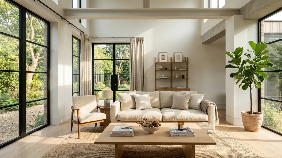
South-facing rooms enjoy strong golden natural daylight from sunrise to sunset, which naturally intensifies warm pigments and can make warm-toned paints look overly saturated and yellow. Unlike north-facing rooms that receive cool, shadowy light, southern exposures bathe walls in direct sun rays all day. This constant illumination changes how paint pigments behave on your walls.
Direct sunlight contains high concentrations of red, orange, and yellow color wavelengths. When this golden wash hits paint with warm undertones, it doubles the perceived warmth. A subtle linen shade can suddenly read like Dijon mustard. Recognizing this solar boost helps you choose paint tones that keep their cool elegance under strong sun.
Why Warm Undertones Turn Neon Yellow in Southern Light
Paint manufacturers mix tint drops into white bases to create off-white and beige shades. Popular warm whites contain raw umber, yellow oxide, and red pigment. In dimly lit rooms, those warm drops create welcoming coziness. They make dark spaces feel friendly and soft.
However, southern sunlight supercharges those yellow drops. At two o’clock in the afternoon, intense solar heat activates every warm particle in the film. The wall reflects so much yellow light that adjacent white sofas and light rugs pick up sickly reflections. This unexpected color shift ruins clean decorating plans.
To avoid this neon disaster, skip paints labeled cream, warm ivory, or vanilla in south rooms. Choose paints with neutral grey, green, or soft blue backings instead. These cooler bases neutralize the golden sunlight, making the paint settle into a pleasing, soft neutral.
The Eye Fatigue Factor: Managing High Solar Glare
Optical glare causes physical headaches and eye fatigue in rooms with southern light. Light Reflectance Value, or LRV, measures the percentage of light a paint color bounces back into a room. Pure titanium white rates at an LRV of around eighty-five to ninety. In a south-facing room, that high reflectance turns drywall into a blinding mirror.
Family members squint when reading books or looking at televisions in high-LRV rooms. You can solve this optical problem by lowering your target LRV range. Drop your wall color down to an LRV between fifty-five and sixty-five. These mid-toned paints absorb excess sun rays while keeping the room bright and open.
Pairing mid-LRV paints with matte finishes tames solar glare completely. The velvety paint surface breaks incoming light beams into soft ambient glow, providing a restful living environment throughout the day.
Best Whites for South-Facing Rooms: Cool and Neutral Champions
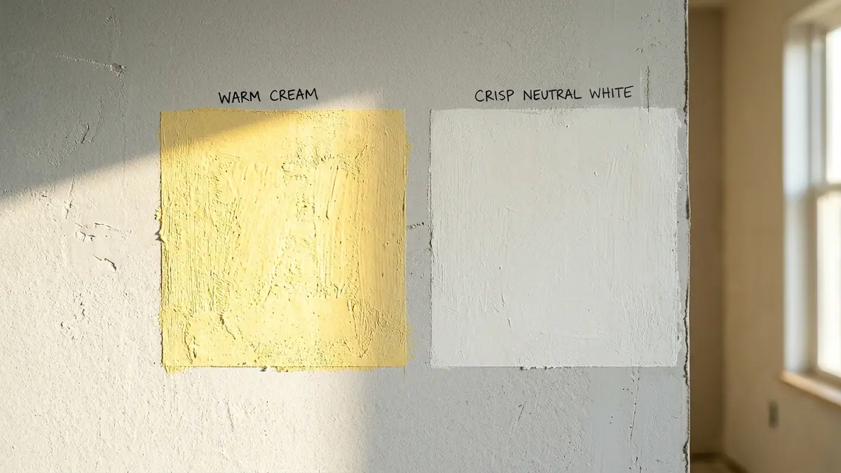
The finest whites for south-facing rooms are crisp, balanced neutrals like Benjamin Moore Chantilly Lace and Sherwin-Williams Pure White, which read as perfect soft whites under warm sun. These shades contain zero heavy yellow pigments. When intense southern sun washes over them, they do not turn buttery. They simply look like clean, fresh gallery white.
Homeowners often worry that cool whites will feel cold or sterile. In a north-facing room, that fear holds true. But in a south-facing space, golden daylight provides ample natural warmth. The sun supplies the warmth, while the cool paint supplies the balance.
Benjamin Moore Chantilly Lace: The True Balanced Neutral
Benjamin Moore Chantilly Lace stands as a top choice for sun-filled living spaces. This paint formula contains almost zero undertone bias. It holds an equal balance of pigment, meaning it neither pulls blue nor yellow.
Under bright midday sun, Chantilly Lace stays remarkably true. It reflects clean natural light without turning sterile. It provides a sharp backdrop for colorful art prints, natural oak furniture, and indoor houseplants. It remains crisp through changing light cycles from dawn to dusk.
Apply Chantilly Lace on both walls and trim for a crisp Scandinavian feel. Paint the walls in washable matte and the woodwork in satin. The matching hue creates continuous flow, while the subtle sheen difference defines architectural trim lines.
Sherwin-Williams Pure White: The Slight Grey Drop
Sherwin-Williams Pure White offers a softer alternative to stark gallery whites. The formula includes a tiny drop of raw umber and black colorant. This small pigment addition softens the paint, dropping its LRV to eighty-four.
That subtle drop of grey absorbs blinding solar peaks. Pure White prevents the harsh, chalky glare common with ultra-bright bases. It looks like a gentle, velvety off-white under south sun without ever turning yellow.
Use Pure White in bedrooms, dining areas, and kitchens with southern exposures. It flatters marble countertops, brushed brass handles, and light hardwood floors without competing for visual attention.
Soothing Color Palettes: Cool Greiges, Muted Sages, and Coastal Blues
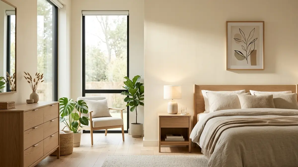
Incorporate soft greiges with cool undertones, muted sage greens, and dusty slate blues to counterbalance the heat of incoming sunlight and create a restful oasis. When a room receives constant sun, cool paint colors deliver psychological relief. Blue and green wavelengths visually lower room temperature, making sunny spaces feel breezy and calm.
These calming hues thrive in southern light. Cool greiges that look dreary or chilly in dark basements come alive under southern sun. The warm rays draw out hidden depth, creating rich neutral tones that feel tailored and expensive.
Sherwin-Williams Repose Gray and BM Classic Gray
Sherwin-Williams Repose Gray works magic in south-facing rooms. On the color strip, Repose Gray looks like a cool grey with a hint of blue-green. But once you roll it onto a sun-drenched wall, golden rays warm the formula. It transforms into the ultimate warm greige.
With an LRV of fifty-eight, Repose Gray sits in the ideal light-absorption zone. It cuts blinding glare while maintaining plenty of ambient room brightness. It hides drywall tape lines and provides a grounded backdrop for linen furniture and walnut tables.
Benjamin Moore Classic Gray provides a lighter option with an LRV of seventy-five. It carries a soft purple-grey undertone that neutralizes yellow sun rays. The result is an ethereal, pale greige that never turns beige or yellow under afternoon light.
Coastal Blues and Dusty Eucalypt Greens
Muted greens and coastal blues turn sunny rooms into tranquil retreats. Shades like Sherwin-Williams Sea Salt or Benjamin Moore October Mist contain heavy grey bases. This grey content prevents the green or blue pigment from looking loud or electric under bright sun.
Sherwin-Williams Sea Salt shifts gracefully through the day. In morning light, it leans into a soft blue-grey. In warm afternoon sun, green undertones emerge, mimicking fresh sea glass. It keeps home offices and sunrooms feeling calm and cool.
Pair these organic colors with natural materials. Jute rugs, linen drapery, and unlacquered brass hardware harmonize with green-blue walls. They create a biophilic atmosphere that celebrates the outdoors.
Sheen Selection: Defeating Sunlight Flashing on Drywall
Specify flat, ultra-matte, or low-lustre eggshell paint sheens to diffuse harsh directional sunlight and prevent noticeable glare streaks across drywall joints. When sunlight rakes across a wall at an angle, glossy paints create mirror-like glare spots. This phenomenon, known as flashing, highlights every taped seam, drywall patch, and roller stipple mark.
Shiny paints like semi-gloss or high satin reflect light beams in concentrated lines. That specular reflection causes visual distraction and ruins wall smoothness. Low-sheen finishes scatter light rays in all directions, softening the overall wall plane.
Why Semi-Gloss and Satin Flashes in Southern Windows
South-facing windows act like giant light projectors. As the sun arcs across the southern sky, light strikes walls at low angles during winter and high angles during summer. If walls wear satin or semi-gloss paint, that angular light creates hot spots that shine right into your eyes.
Reserve semi-gloss or satin enamel strictly for baseboards, door casings, and window sills. Wood trim has smaller surface areas, so its gloss provides tailored framing instead of blinding glare. For drywall fields, invest in premium washable matte paints like Benjamin Moore Regal Select Matte or Sherwin-Williams Emerald Matte.
These modern matte paints offer the durability of satin with the glare-free beauty of flat paint. You can scrub off handprints and scuffs without polishing the paint film into shiny streaks.
Interactive Tool Integration: Room Light Paint Undertone Finder
Choosing paint colors requires testing undertones under dynamic solar cycles. Before heading to the paint store, check your room lighting profile with our interactive Room Light Paint Undertone Finder. This tool matches specific window exposures with balanced paint formulas to ensure reliable results.
Input your window direction, room square footage, and flooring tone into the finder. The algorithm calculates your room solar heat index and recommends paint swatches with ideal LRVs. It also flags paint colors likely to turn yellow under midday sun.
Using digital light analysis eliminates costly repainting projects. You select the right paint undertone on your first try, creating a serene, sun-soaked space that stays comfortable all year round.
South-Facing Paint Color Recommendations Matrix
Comparing paint formulations confirms that selecting cool-balanced neutrals with moderate LRVs creates a calm, glare-free, and inviting living environment. The following comparison matrix details five proven paint choices for south-facing spaces across target LRVs, undertone profiles, and visual atmosphere.
| Color Family | Recommended Paint Swatch | LRV Value | Undertone Profile | Visual Atmosphere in Full Sun |
|---|---|---|---|---|
| Crisp Neutral White | BM Chantilly Lace (OC-65). | 90.0 (high). | Pure balanced white with zero yellow. | Clean, bright, soft white without yellowing. |
| Muted Soft Off-White | SW Pure White (SW 7005). | 84.0 (balanced). | Soft neutral with drop of black and grey. | Soothing, gentle, prevents blinding glare. |
| Cool Transitional Greige | SW Repose Gray (SW 7015). | 58.0 (ideal). | Cool greige with subtle blue-green drop. | Turns into a perfect warm greige in sun. |
| Muted Organic Sage | BM October Mist (1495). | 46.3 (deep). | Soft silver-green earth tone. | Restful, grounding, cools room temperature. |
| Dusty Coastal Slate | SW Sea Salt (SW 6204). | 63.0 (moderate). | Muted green-blue with cool grey base. | Refreshing, airy, neutralizes golden glare. |
Select your paint shade based on how you use your sunny room. If you want an open, bright living room, pick balanced neutrals like Chantilly Lace or Pure White. If you spend afternoons watching television or reading, choose mid-LRV greiges like Repose Gray to absorb harsh solar glare. By working with natural light, you build a tranquil home that shines in every season.
Frequently Asked Questions About South-Facing Rooms
What paint color is best for south-facing rooms?
Cool-toned off-whites like Sherwin-Williams Pure White and balanced greiges like Benjamin Moore Classic Gray are best. South-facing light is intensely warm and golden, naturally warming up cool undertones into perfect balanced neutrals.
Why does white paint look yellow in south-facing rooms?
South-facing rooms receive warm, golden sunlight throughout the day. If your white paint contains warm yellow, cream, or beige undertones, the golden sunlight magnifies those pigments, making walls look unpleasantly yellow or buttery.
What LRV should paint have in a south-facing room?
Aim for an LRV between fifty-five and sixty-five for colored walls, or around eighty for white paint. Avoid ultra-high LRV paints above eighty-five, which reflect blinding sunlight glare and cause eye strain.
Can you use cool grey paint in a south-facing room?
Yes, south-facing rooms are the ideal setting for cool greys and blues. The abundant golden sunlight counteracts their chilly undertones, transforming cool greys into sophisticated, soft, and balanced neutral tones.
What paint finish reduces glare in sunny rooms?
Use a flat, ultra-matte, or low-lustre eggshell paint finish on walls. High-gloss, semi-gloss, and satin paints reflect direct sunlight like mirrors, causing harsh flashing streaks that emphasize every minor drywall imperfection.